7 Types of In-App Animation Improving Mobile App User Experience
Micro-interactions, transitions, and in-app animations should do one great job, which is to explain the logic of an app to a user and improve the overall app usability. You might hear it many times: good design is obvious, but great design is transparent. This saying is surely one of the biggest truths of user experience design. Especially when it comes to in-app animations.
As everything integrated into the UI design of your mobile app, animations must be a functional element rather than the decor. We’d like to share in this article our expert knowledge on how to create a really great in-app animation that catches user attention but doesn’t distract from your mobile application itself.
Good animation vs. Bad animation
The first thing that makes animation good is its duration. Advisable animation time ranges from 250ms — 900ms. Good animation should be fluid and help visualize the change in the state of a system. It provides feedback to the user on taps and gestures giving them a sense of direct interaction.
Bad motion graphics is usually slow and excessive. Such animation rather distracts and irritates users than help them to understand mobile app logic and improve usability. Bad in-app animation is inconsistent with the rest of the user experience. Bad animation ends up confusing a user.
Types of in-app animation and principles of design
Being one of the hottest UI design trends today, app animation may become a cherry on top in your mobile user experience. You need to know the most popular types of in-app animations, their place, and function within an app.
Visual feedback animation
The main task of a visual animation is to inform a user if a certain action was successful or failed. It’s crucial for any user interface. It’s so natural for us to feel that objects respond to our interaction with them in the physical world.
Our world is not as cold as you could think before. Everything has a certain reaction, even if this reaction is almost invisible. Good animation designers should be able to imitate interaction with real objects in a mobile application.
Imagine, you press a real button. What do you feel? You feel the strength put into this action and the resistance of the button. You can create almost the same effect using in-app animation which will make the user experience even more interesting. Interacting with sensor screens we tackle vibrations and visual signs to get the response from a mobile application. Animated buttons, switches, color change, or tick help a user feel and understand that an action is done.
Progress and Loading Animation
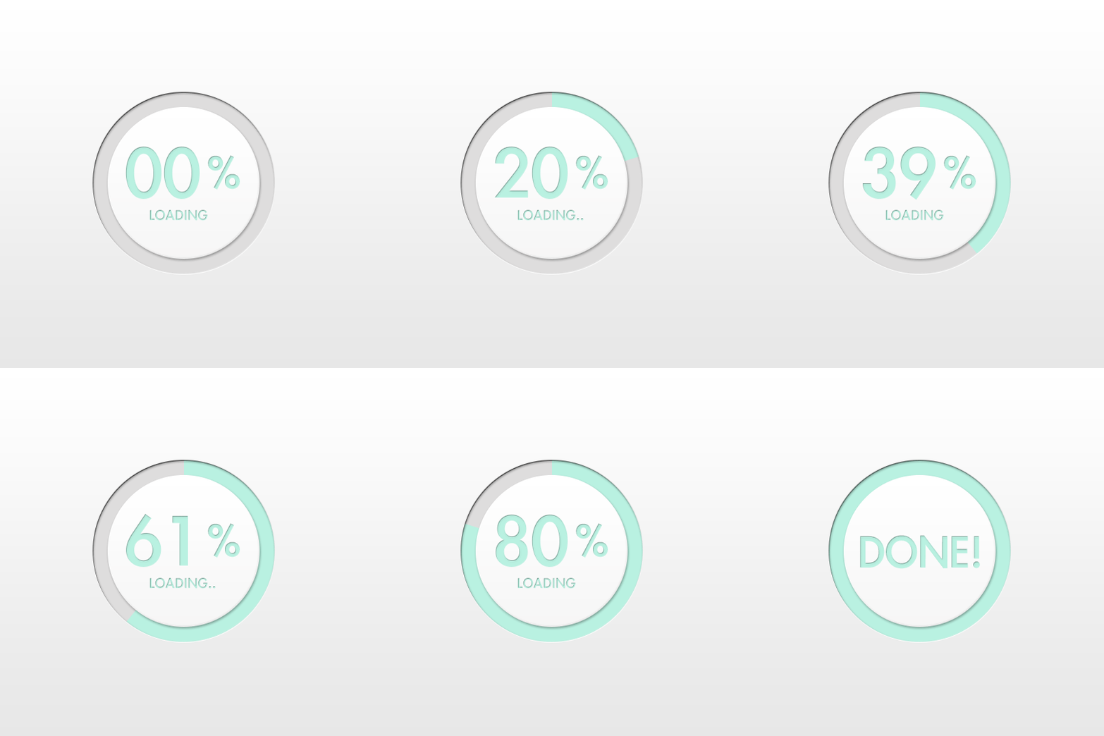
Animation of progress bars, timelines, and other dynamic elements can do more for the success of the overall app user experience than you could imagine. Progress animation helps to inform a user that he is moving forward in the process. Moreover, it helps to provide psychological comfort for a user while waiting.
When you let a user understand the level of progress and what’s going on at the moment, it helps to eliminate the negative user experience. Besides this, progress animation makes a process of waiting more pleasant being itself the entertainment element.
Good progress animation helps not only set the right user mood but also can become a beautiful design peculiarity that will distinguish your mobile app among others.
Regarding a loading animation — this type seems the most popular in apps. Often it’s considered as a sub-type of progress animation. It has functions that are similar to a progress animation — informs a user about moving forward in some process and also entertains while waiting. There are different types of loading animation such as loaders, preloaders, and pull-to-fresh animations.
Function change
The great idea is to show a user that the in-app element changes when to interact with it. This type of animation perfectly works when you need to illustrate how the functions of the element can change.
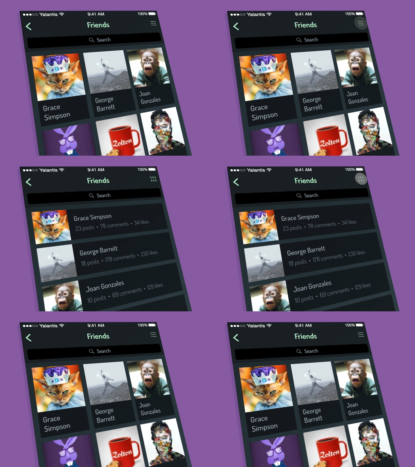
Function change animation is usually accompanied by buttons and icons like in the example below. Here, you can see the animation displaying that the icon changes along with the content to indicate that the function of the button has changed.
Navigation Animation
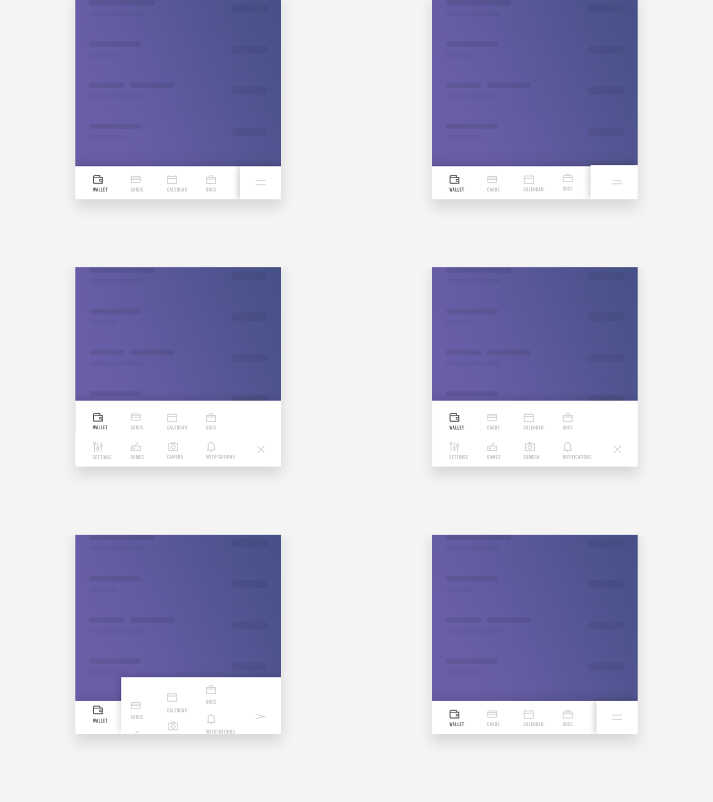
The main designer’s mission is to simplify user interaction with a product as much as possible. That means the more complex structure an app has the more time a designer should spend to make the navigation easier and intuitively understood. In this case, navigation animation is something that saves a game.
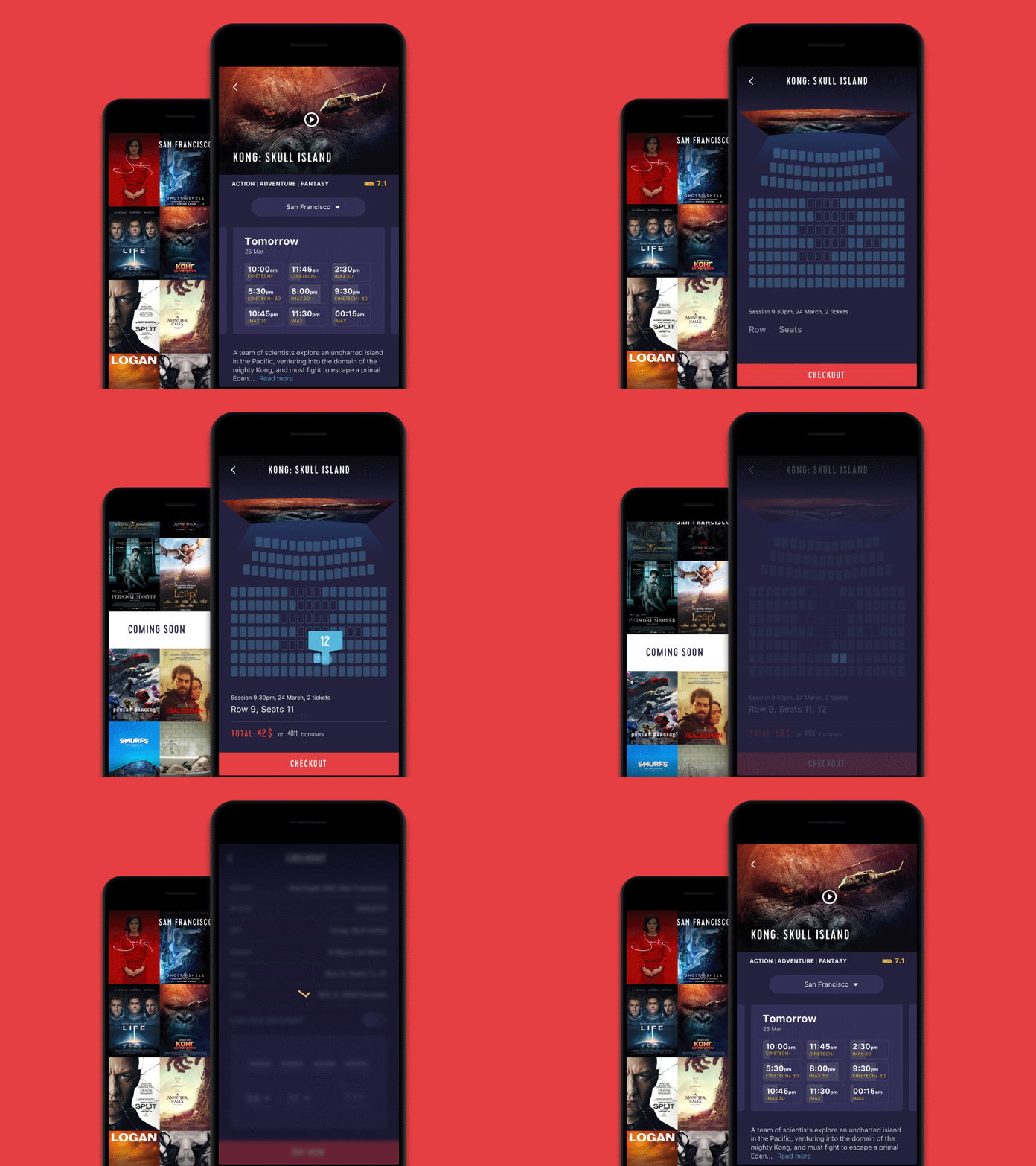
A mobile app user can easily find a hidden in-app element if you display it using animation. In the animation example below, you can see that additional options appear from the bottom of the screen to refine the selection process.
Marketing animation
Animated marketing or marketing animation — both constitute a very engaging way of communicating with the target audience. The animation of logos, mascots, and similar elements can play a great role in increasing brand awareness.
Marketing animation is usually used in order to attract user attention to brand elements. It helps to start building more emotional relationships between a brand and users. Especially, when the in-app animation is really fun and memorable.
Marketing animation is used the most often on the welcome app screens. There is only one chance to make the first impression. And that’s definitely on the welcome screen. So why not start user interaction with a nice marketing animation?
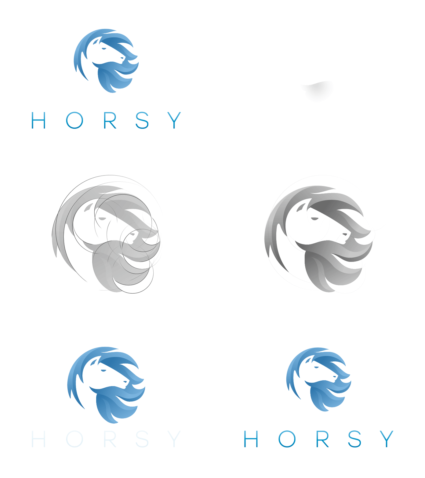
A nice example of a marketing animation is an animated logo created for the Horsy app.
Catchy and memorable, this animated logo will not leave indifferent to this mobile application. An effective logo animation can become a trigger for excitement, joy, and intrigue.
Fun animation and storytelling
We love stories. Would you, probably, say that you didn’t like fairy tales when you were a child? Don’t think so. Storytelling is something that can make your mobile application really engaging. Or better to say storytelling animation and gamification.
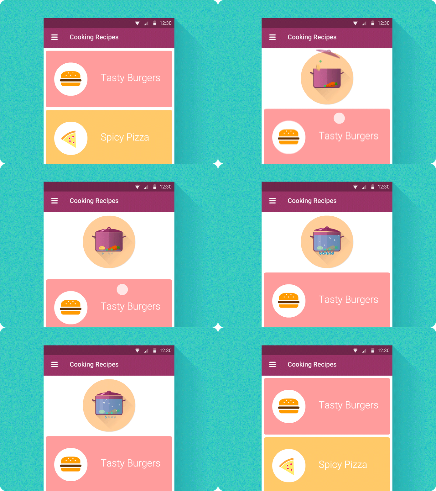
Animated stickers, badges, rewards, mascots — all these elements can breathe life into your mobile app and make an app interface much more interesting. Here’s a nice example of storytelling animation. We’re sure that this a pull-to-make-soup feature will not leave you indifferent.
When designing a fun app animation make sure that it doesn’t overshadow or isn’t time-consuming.
Animated Notifications
Here’s a very simple question that will help us move further in our discussion. What is an app notification? It’s a sign attracting the user’s attention to the updates in a mobile application. The initial idea of the notification is to keep the user informed about the most important information. So, if the information is really important it’s better not to miss it.
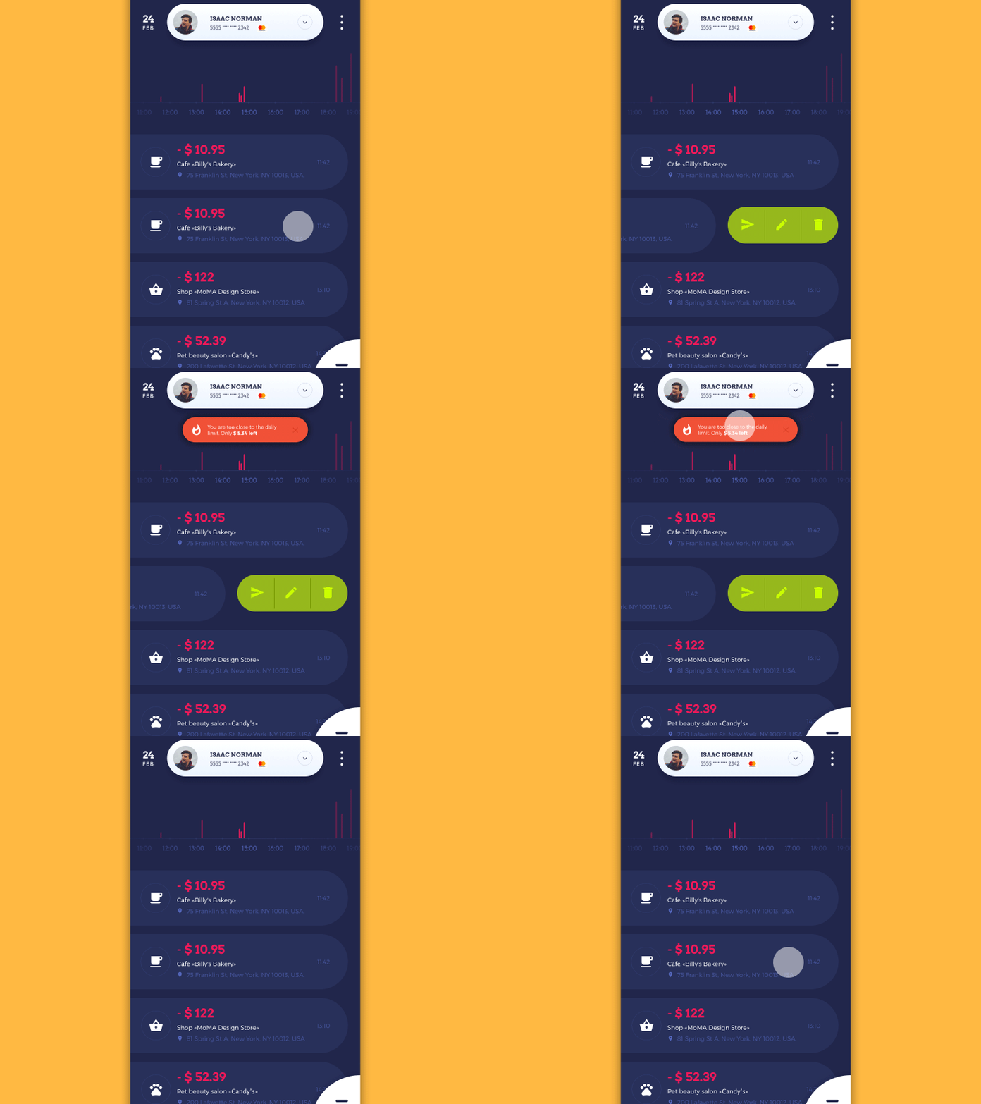
Unobtrusive in-app animation makes notifications noticeable, entertaining, and helps not to miss the important updates.
Here is a nice example of animated notifications designed by Tubik.
Conclusion
Unobtrusive and engaging animation will definitely help you make a user communicate with an app more easily and naturally. We hope this article will help make your animation look like the in-app magic breathing life into a mobile application.
To make things alive is the Creator’s option. So, why not to become the creators of the stunning mobile experiences we can easily interact with.


