WinRar
Give your online business presence a fresh update with a unique rebranding concept. Here's how we have done it for WinRAR.

01
Background
New WinRAR
Everyone knows the good old buddy WinRAR. This world's most popular Windows utility is the choice of millions of users around the world. It allows you to create and view archives in RAR or ZIP formats and unpack different archive file formats with a few clicks. Many years have passed since its first release, so it is high time to create a unique rebranding concept!
02
Logo redesign
Upgrading the classics
We have redesigned WinRAR's logo, preserving a hint at a previous old-school style. Staying aligned with the primary brand concept and colors, we've added simpler shapes and fresh gradients.
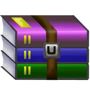
The old logo
It's recognizable but outdated.
Iteration #1
A much better version but still needs improvements.

Iteration #2
Good! But it is still difficult to perceive visually.


Simple yet recognizable shapes of folders reveal the concept of the "Library."
We've used smooth gradients instead of a previous color palette.
We've applied the old-school fonts, Arial and Proxima Nova, fitting the culture of the programming community.
03
Interface
Updates
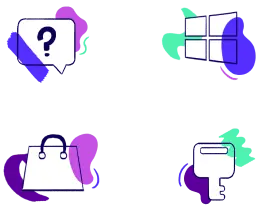
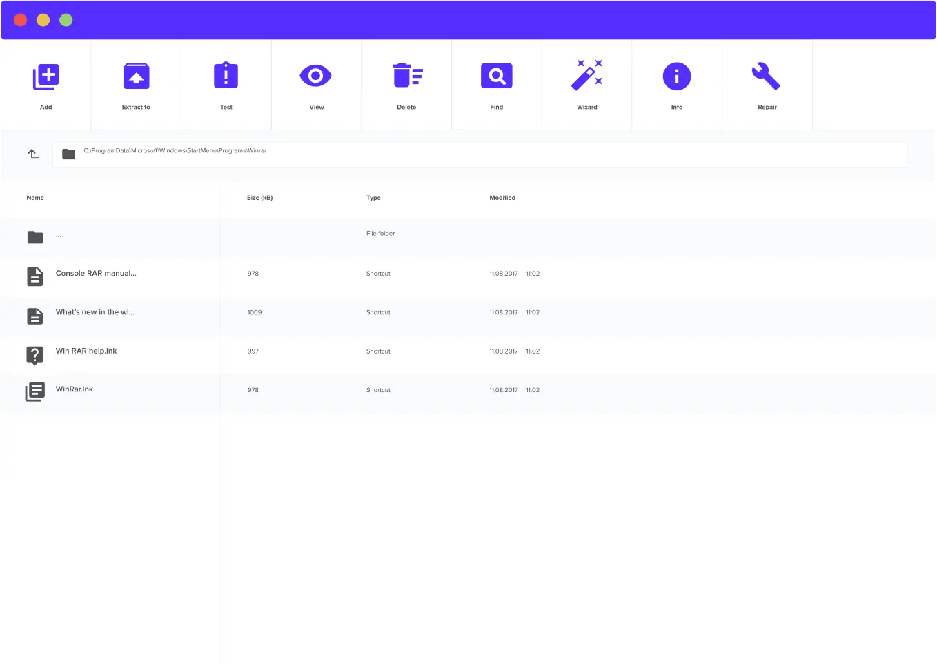
To build an intuitive user interface, we have followed the essential principles of effective icon design: consistency, legibility, and clarity.


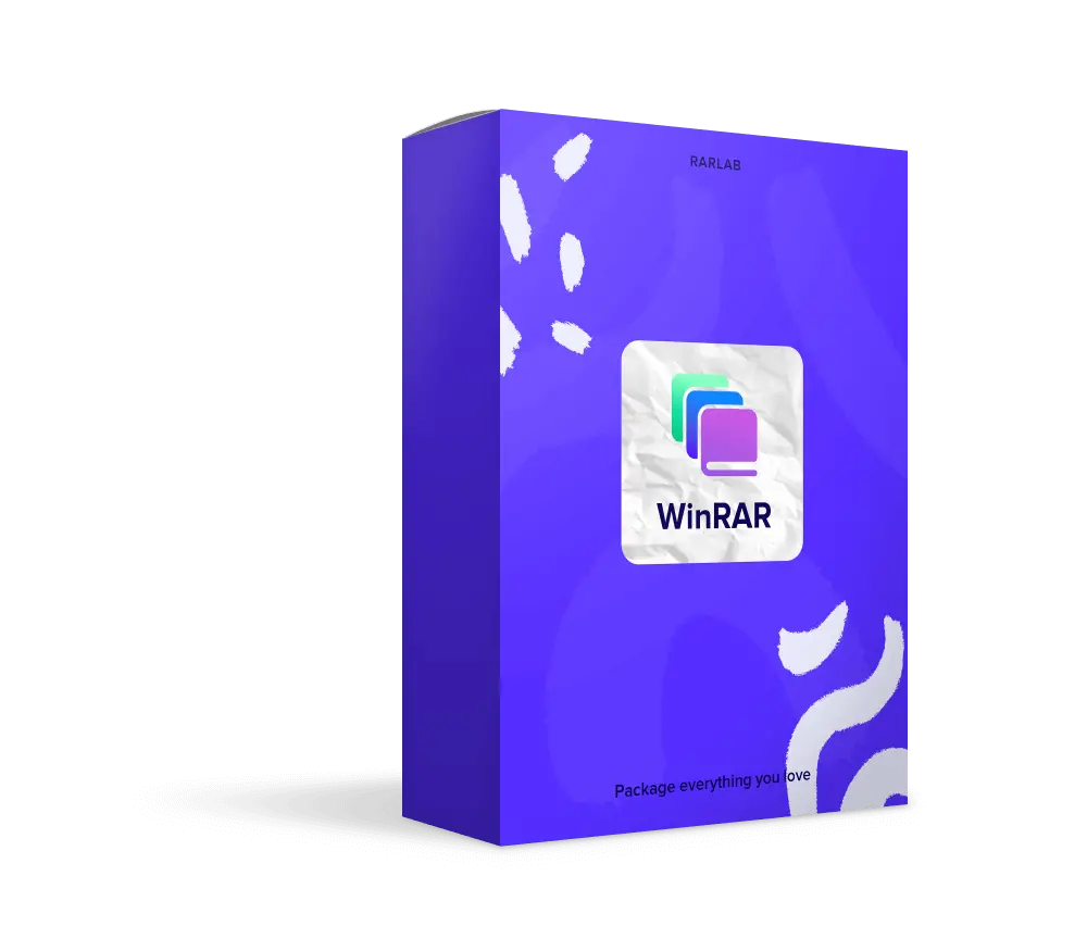
Product package
Bold brand colors and other elements of a new product box create an additional visual appeal, draw the customer's attention, and make a product stand out.
04
Website
Home page
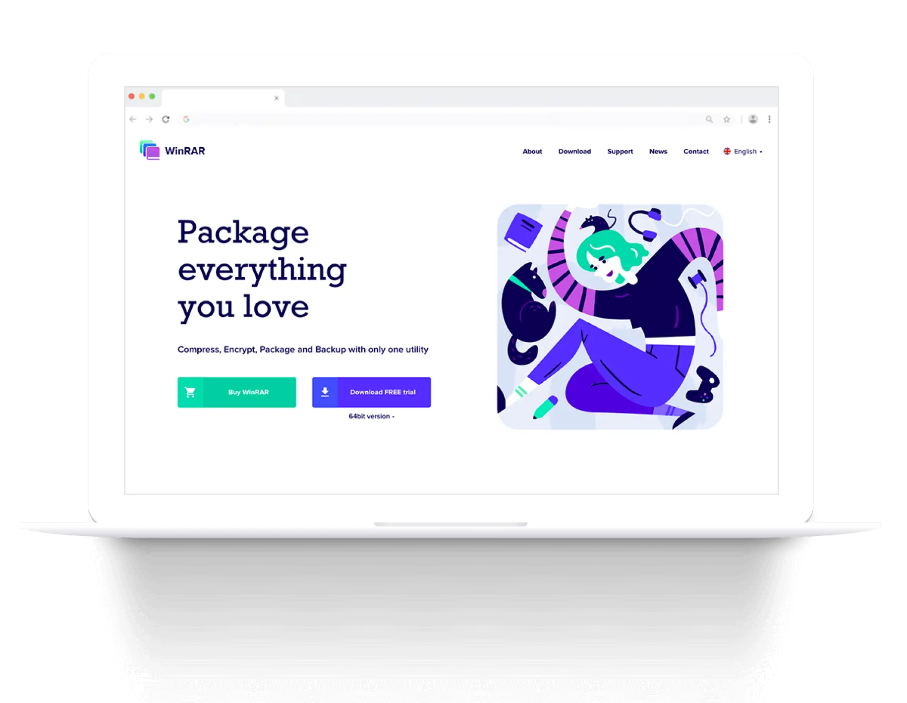
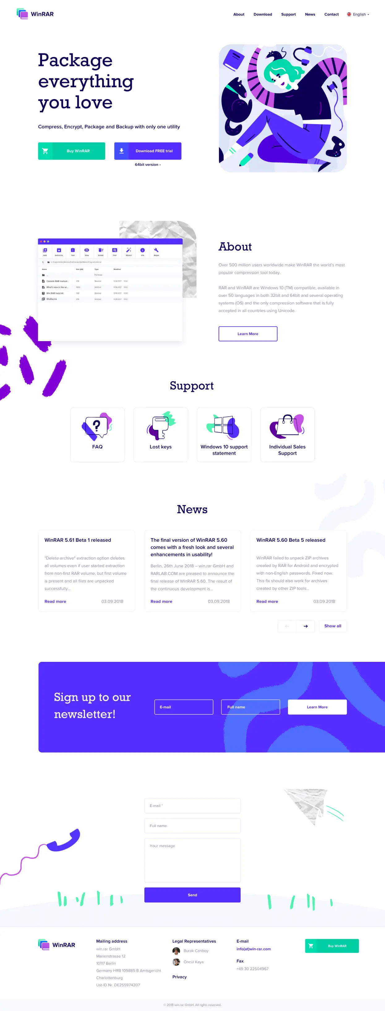
The navigation bar is now visible at the top of a page. An updated landing page allows you not only to buy and download WinRAR more easily but also displays all the important information about a product.
Download page
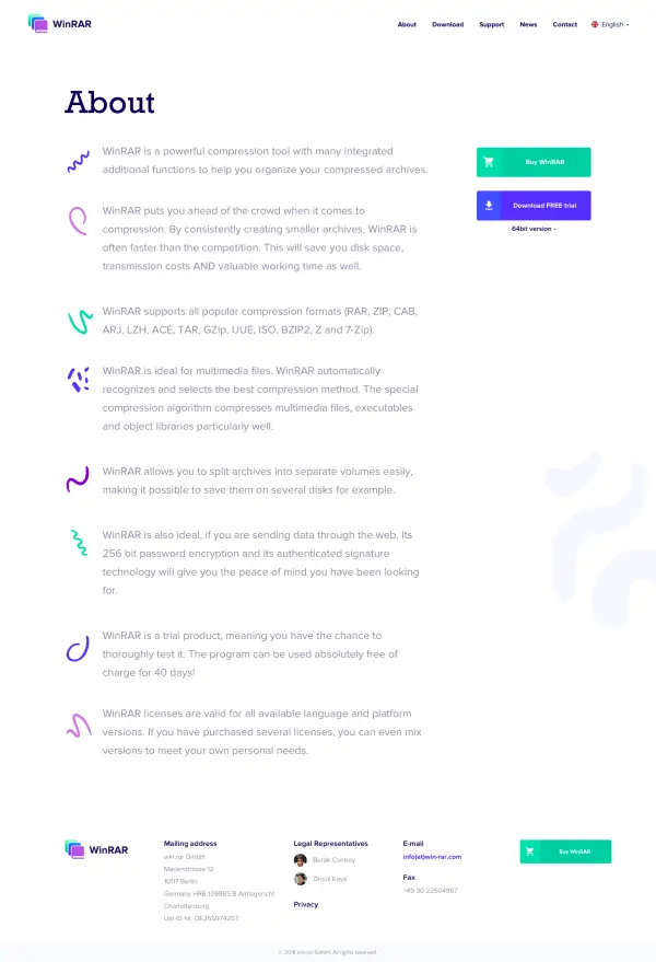
About
The product information has become much more consistent and easier to read.
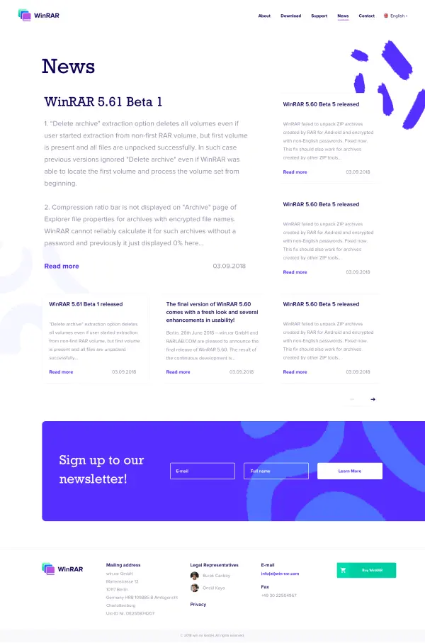
News
Now, a redesigned media page shows news thumbnails and displays the last update in a large format.
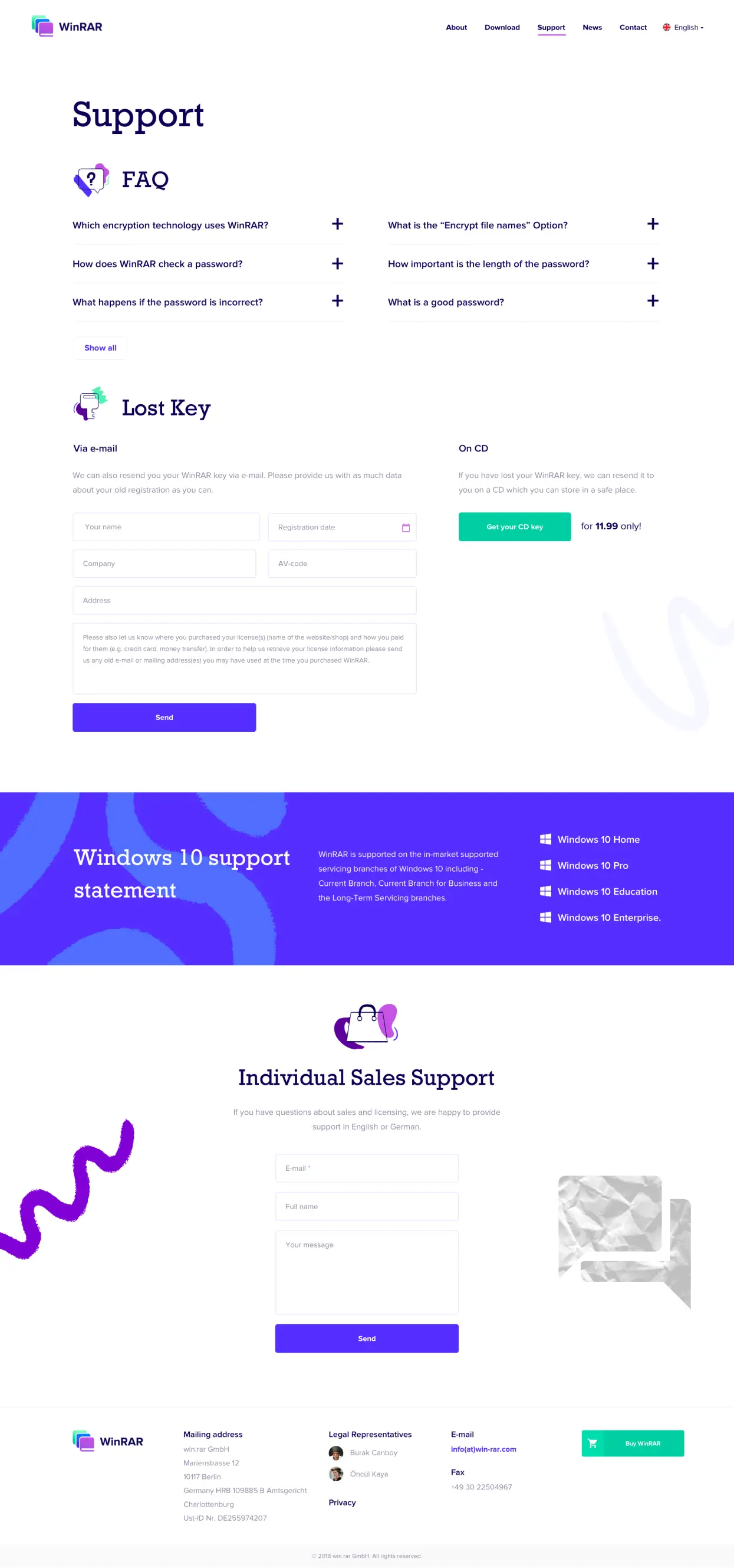
Support page
A previous support page had several clickable options that required the user's unnecessary efforts. Now, they are arranged hierarchically and have new beautiful icons. The FAQ section displays a few previewed questions while The Lost Key and Individual Sales sections display a contact form instead of an email address.
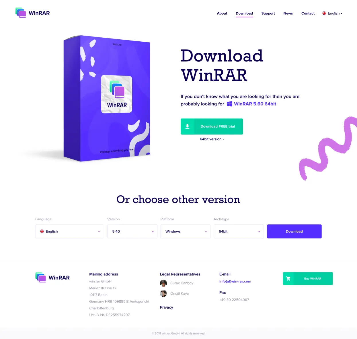
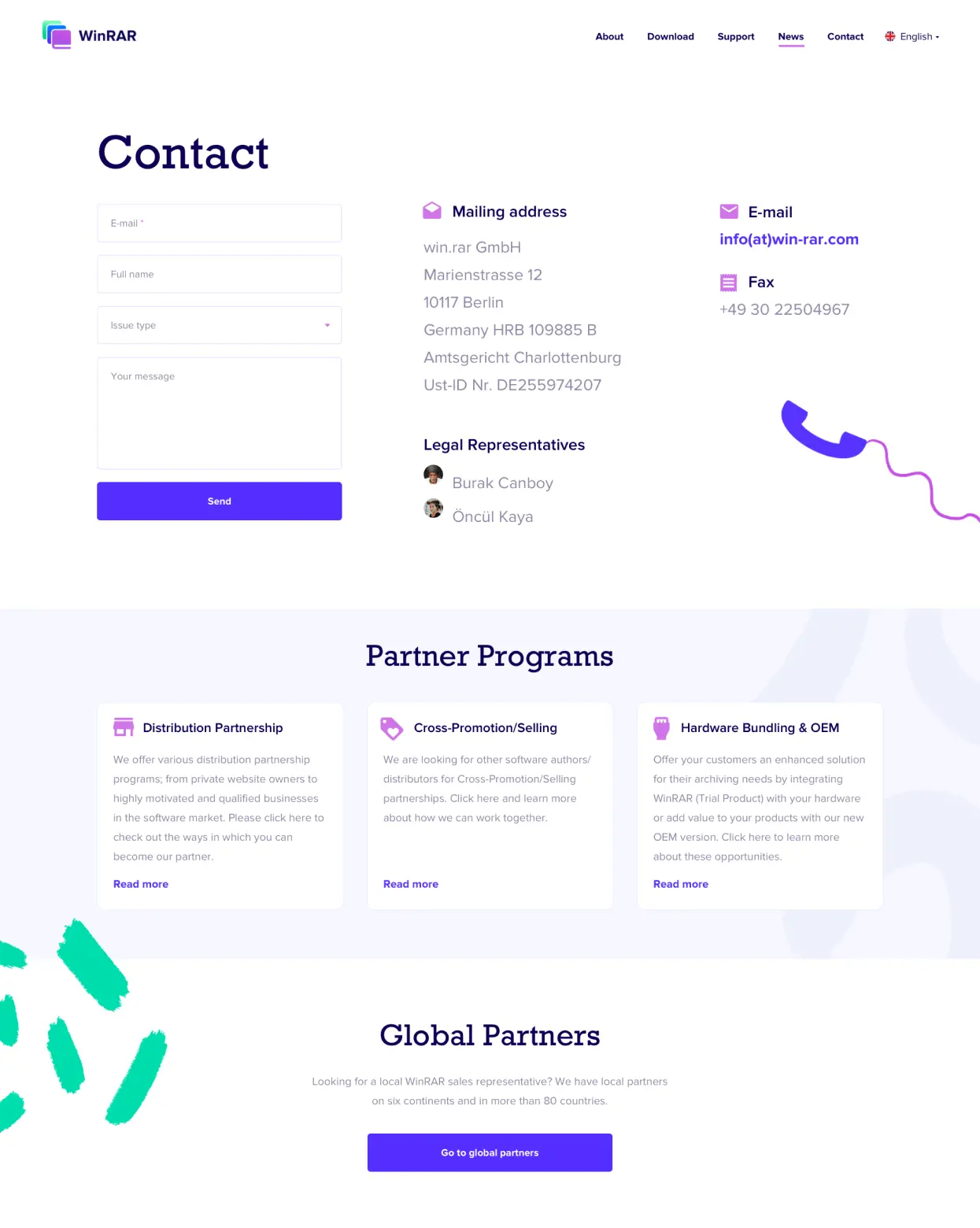
Download page
Instead of a few contacts, a page now has an extended contact form with a set of dropdown options, consistent fields, and a block with the partner programs below.
H1 - Rockwell 95 pt
H2 - Rockwell 60 pt
H3 - Proxima Nova Semibold 26 pt
We've enlarged the text of short accent statements and applied Proxima Nova Regular 32 pt.
We have used Proxima Nova Regular 32 pt because this font looks neutral and harmoniously combines with bold branding elements. It is easy to read and supports different languages, including Cyrillic symbols for Slavic languages.
Links - Proxima Nova Bold 22pt


