Have you ever felt like designing a website is more complicated than it seems? Well, you’re not alone! Especially in the world of e-commerce, where design plays a crucial role in selling products, it can be pretty challenging. And when it comes to furniture-themed websites, things get even more complicated. But don’t worry, there are plenty of furniture website design examples that can inspire and guide you.
So, we need to create a furniture store website design that meets one special requirement: the design must get the customer in the right mood. Upon reading, they should wish to create their stunning interior and think, “Oh wait, I’m surfing the great furniture website right now. I think this sofa will fit perfectly in my bedroom!” They may use your website for shopping because you’ve already tuned them up.
Yes, creating an efficient web design for your business can indeed be challenging. Let us share 5 great tips for creating modern and sustainable furniture website examples.
5 tips for creating a furniture and interior website design
Creating a perfect furniture store web design is challenging. Still, it might be much easier if you look at excellent furniture website design inspiration. Also, you can learn some valuable tips and tricks about website furniture design from professionals.
Here are 5 valuable tips from our furniture website design company that will guarantee your success!
1. Keep things simple

The first and one of the most important furniture design tips is keeping things simple. Some website designers try to create a memorable and catchy design in a weird way. They tend to overload the site with a bunch of features like chats, dozens of pages with various unnecessary statistics or info, and other solutions that are disputable for the current niche.
As a result, it is hard to get through all this information noise to buy something. Therefore, it becomes a deadly decision to overload the layouts of web design for furniture stores.
The process of buying furniture is a kind of art. The furniture website layout must motivate customers to look for furniture they can use in projects and then buy it on the current site. Lots of fields, sections, or bars only cause headaches. They do not evoke any shopping desires.
The layout is an essential part of the website. It’s a structure of all elements that developers use to create the design. Try to avoid excessive functionality and blocks in it. Keep it simple but effective. Do you have any ideas on how to do this?
If you’re in doubt about how to design a furniture website, try to use a classical solution for layouts:
- The header is the part that can display the company logo and include some pagination functionality. There, the designer can place hyperlinks to the other pages on the website, like “Contact Us,” “About Us,” etc. Also, it’s a great place to log in or sign up.
- The body is the central part where you may allocate all-important content. Often, it’s a list of products. The way you display it is all up to you. Be creative and find your memorable style. Your sales can grow if you can emphasize your product but not the design of the website.
- The footer is a place for features that help retain visitors. It can be a contact form, newsletter, sitemap, furniture website navigation, minimalist logo or social media of the company. The main goal is quite simple – just keep users’ attention.
This is a tested and reliable method of designing a furniture website layout. If you know your way around website structure, you don’t need to follow this layout strictly. Add some creative ideas! Change the order of blocks, add fancy sidebars, or swap the content between sections. This is art, too. Be original.
The best furniture websites often use a minimalistic design. This choice is nonintrusive, avoiding information overload and headaches. The design remains simple but efficient.
Minimalist elements do not steal any attention from the products. It’s easier to sell something if a customer’s attention is not sprayed all over the website. Thus, customers can concentrate on the most pleasant part—the process of shopping. Even an ad banner won’t ruin this impression.
2. Implement easy navigation

One of the furniture website UX trends is creating a user-friendly interface. Users tend to buy something if they can easily find the exact desired item. Quick access to all available products is one of the required functionalities.
Implement product filters for furniture websites. Users need the ability to select only a few items from the whole furniture range. For example, it can be only brown products or the cabinets of a particular brand.
The variety of options and the ability to choose between items are great advantages. It is convenient to fine-tune the item filters and retrieve all the results based on specific criteria. Those factors lead to a positive UX (User Experience), which means that a customer will be more likely to buy something in your online store.
3. Ensure color harmony

The color schemes for furniture websites determine everything for an interior design website design. It’s often the part that users mention the most. Try to use non-aggressive neutral colors and shades. The reason is simple: too bright, offensive, or provocative colors can distract the customer from the product you are trying to sell. Such an approach harms the entire sale process.
A similar idea applies to effects, textures, etc. You can use them to make the design ingenious and creative but don’t overdo it. Make sure that this beauty won’t steal all the attention from the central part of the site.
4. Provide meaningful content

Since it’s an online furniture store, its primary goal is selling furniture in the fastest and easiest way. To achieve this, think about how to organize the content of your site. Try to find out how to place your products for the convenience of use. It’s another user-friendly aspect.
Create conditions so the customer will not have any harmful UX during shopping. If the user can access all the desired information in a few clicks, you will sell more—retail wins from such an approach.
For a furniture e-commerce website design, it is a great decision to make a product card for each furniture unit. In it, you can put a slideshow, a short description, and even a 3D furniture visualization on websites. You can also put some general information about the most popular brands. This may help the customer understand their needs and choose something based on quality or appearance.
A 360-degree tour in a virtual room and augmented reality to showcase the selected product are also helpful. The user can see whether a new piece of furniture fits the place or not.
5. Lend a helping hand

Despite how easy your website is to use, some customers may face various issues while shopping. Every person is different. It is always a good practice to create FAQs (Frequently Asked Questions) on your website with a list of common issues. It can be a user manual, a separate page with a list of questions, footnotes, or tips that are shown when a user highlights certain elements.
Here’s another situation. Imagine that 99 out of 100 customers understand your shipping rules, but the 100th person doesn’t understand it clearly enough. That example doesn’t mean that you need to ignore such issues. Of course, you don’t!
It might be a decent idea to implement an online consultant or support team that can help users with their uncommon questions or weird bugs as soon as possible. Other options are a forum with open discussions, a technical blog, or a digest.
Best furniture website design examples
Those furniture design tips are handy for creating the best furniture websites. However, it can be challenging to imagine how those methods would work in a real business product. For further inspiration, let’s take a closer look at 10 best furniture website design examples.
Modern Digs

As you can see, Modern Digs store has a neutral white background. It’s a tremendous classical solution. The white color doesn’t disturb the eyes or steal any attention, so customers can focus on the furniture. The website implements a filter system and a great furniture website search functionality. The user can filter the furniture by its size, color, availability, price, or selection.
It also includes the ability to sort all items by price or popularity. It’s not quite extended but has a minimal amount of functionality for comfortable shopping.
The product card is also minimalistic, including general availability information, a short description, and a gallery with several photos. The footer contains some additional information, like sales.
This is an example of a great interior design website design. The user’s attention is focused on the furniture, not on the website’s appearance.
Wogg

Here’s another furniture website design inspiration. Wogg also uses a neutral white background. The entire site’s body is a clickable gallery of products. The photos are high-quality and take up a considerable amount of space.
This is an excellent solution because the customer concentrates on the view of how the furniture looks. They can just scroll the page down for the description of the item. The fancy font helps to provide an outstanding reading experience.
IKEA

IKEA site is one of the great furniture website design examples. It has the benefits mentioned before, but let’s focus on the product card. When you open it for the first time, you just see the preview, the gallery, the essential shopping info, and a link to the specification. You need to scroll the page for further details.
At first glance, there’s no information noise, which is a great decision. All the attention is on the product’s appearance.
Zara Home

Zara Home’s furniture e-commerce website design represents a creative layout solution. All the information, contact pages, and section links are allocated vertically on the left side of the screen, while the site’s actual content and the footer area are on the right side.
Yourhome

Yourhome website contains some clever ideas—for example, the digital diorama of a certain collection. The user can click on each of the collection components, and a pop-up window with general information will be displayed. It’s a great option for visualizing the furniture’s appearance.
BluDot
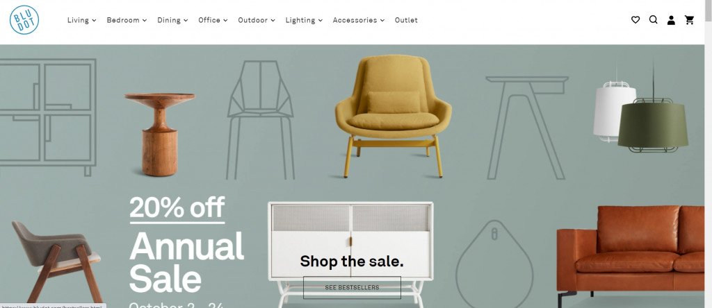
BluDot is one of the best furniture website design examples for a minimalistic and simplistic style. It has everything you need to see and read on the furniture website: high-quality furniture photography, brand history and ideas, and a convenient catalog that is easy to navigate.
Bunny Williams Home
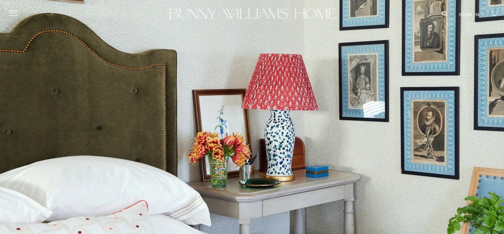
The furniture website designers of Bunny Williams Home store have a unique approach and vision. The interiors look really innovative, and even the most minor details, like lighting, colors, and accessories, are well thought-through. The website definitely catches the eye from the very first sight and makes you want to discover more.
Amazon
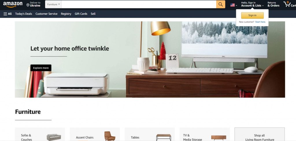
We cannot leave the giant of furniture website development out. Amazon’s furniture marketplace has a sleek design, and this section of the website is straightforward to navigate. All the catalog sections are nicely framed and contain everything you might need for furniture shopping.
Perigold
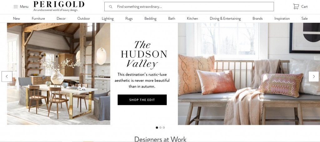
Perigold offers a luxurious furniture shopping experience, as can be seen in its exquisite furniture website design. They also allow users to browse the catalog by style and lifestyle, not only by items or rooms. This is a handy feature for the most sophisticated interior designs.
Henge
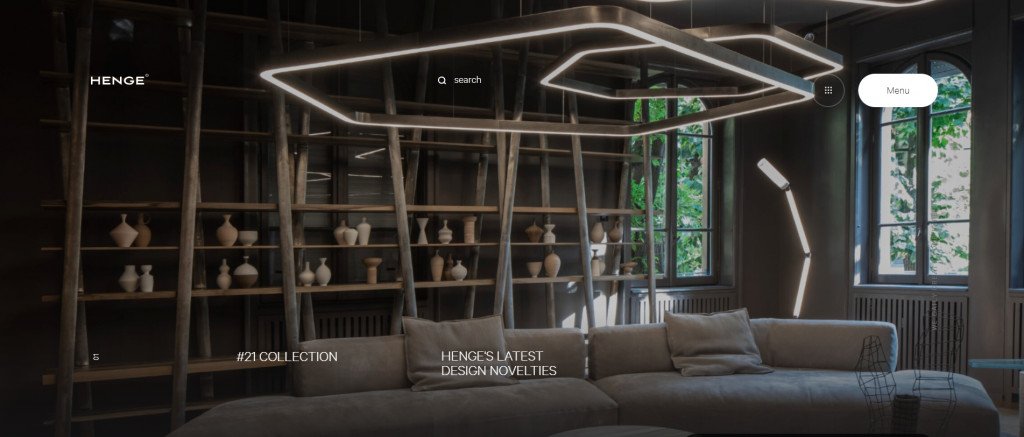
Henge’s furniture website designers have created not only an online store but a whole shopping experience. Their website gives the impression of visiting a showroom with the best interior design examples. You can see and feel the brand’s philosophy reflected in the furniture website design, which resembles natural materials and colors.
Final thoughts
The process of creating a furniture website design for online stores isn’t about creating the most shining and colorful style. Overloading the page with excessive elements and using dazzling colors is not always the same as being creative.
The best furniture website design is simple but handy. It’s elegant in its simplicity, informative but not overloaded, and fancy but not pretentious. This approach allows the creation of successful and beautiful furniture websites.
Don’t worry if this process looks a bit complicated. At Fireart Studio, we know how to create luxury furniture website design, budget-friendly furniture websites, and even kids’ furniture website designs. Our team of masters is adept at solving such tasks. Reach out to us so our designers can develop an excellent design for you!


