Good SaaS web development and design can differentiate a company from its competitors. Choosing an outstanding approach is a vital component of the marketing and growth strategy. But what is good design, exactly? It’s about creating a seamless, engaging, and productive user experience that efficiently resonates with potential customers and meets their needs.
If the site fails to achieve this goal, users will start looking for another company, and your revenue will go to someone else. To avoid this, check out our six excellent tips about how to design a SaaS website from an expert website and MVP app development company.
SaaS web development and design: seven tips on being really cool
Here are the most useful tips on dealing with web design for SaaS.
1. Define your target audience

Defining the target audience is the first step to take, and the company may fail if you miss it.
Identifying your audience before starting work on web design for a SaaS company is paramount. The content and layout should meet the expectations of your audience. The site should be stylish, helpful, and convenient to use.
To figure out more details about your target audience, pay attention to the following points:
- What problem does your software solve? How can your potential customers benefit from your product?
- At what stage of the buyer’s journey is your target audience?
- Does your audience have any preferences? Are they looking for any special features?
- Which offer format does your audience prefer? Free trial? Webinar?
Remember that a free trial is among the most popular options, but it still has certain disadvantages. A free trial may not work if, for instance, your software is too complicated, and it is hard to use it without training, which is not included in the package.
- What language do your potential users speak?
We don’t mean English, Spanish, French, or any other language — we are talking about the vocabulary of your audience. Users won’t appreciate complicated terms they are not familiar with — they will simply start looking for another SaaS website.
2. Show user interface (UI)

Adding pictures is great, but choose them carefully. You offer software, so show your potential users its user interface or UI. Pictures must be easy to find, so we recommend locating them right on the main page — they will persuade users to read more. And obviously, use only high-quality pictures. People won’t take your website seriously if the images are blurry.
3. Choose a catchy headline

In short, a headline is your offer described in a few words. Just like the mottos of the most popular brands, it should be short and clear. Avoid complicated sentences, as no one will remember them.
And please, be creative. Your site won’t be very successful if the first line users see is something like “The best SaaS company ever”. Make up something more memorable.
Here’s one more little tip related to headlines: when coming up with your headline, keep your target audience in mind. Imagine being them. Ready? Now think which headline would motivate you to stay at the website and discover more.
4. Call your users to action

CTA, or call to action, is a way to tell users what to do to achieve their (and your) goal. Some of them may simply have no idea what to do after exploring the website. So make their lives easier — tell them where to click.
CTA should be even shorter than a headline — we advise that you use no more than 5 words. Choose them carefully. You can always go for something like “Download a free trial”, but “Get a free trial” sounds better. We would even prefer “Get my free trial”, as using first-person phrasing can increase a click-through rate by up to 90%.
If you are not working on a landing page but on a website, make sure to place a CTA button on every suitable page.
5. Make navigation convenient

A convenient navigation bar is an absolute must — otherwise, your potential users may get lost and feel confused. As a result, they will download someone else’s free trial, not yours.
There are a lot of ways to design a navigation bar. You can make it fixed, non-sticky, vertical, horizontal, etc. The final choice is up to you, but we are still going to give you several universal recommendations:
- If the bar contains not only text links but also some icons, it is essential to make it clear to users what these icons mean. If you don’t do this, they will have to check every icon and waste time.
- If there are too many links to include, group them and use drop-down menus. Too many links and icons will turn your website into a confusing mess.
- Add a search bar and some filters if applicable. This would be especially helpful if your site contains a lot of information, and the navigation bar is pretty full.
6. Pay attention to the website’s structure

A website full of text may be very informative, but extremely boring at the same time. Your potential users won’t read endless paragraphs of text — they may leave very quickly right after they see a site.
Apart from working on visual content and creating a one-pager or a responsive web design, SaaS companies usually use these moves to keep visitors engaged:
- Add pictures of your software, videos, graphs, animations, etc. Even a set of facts can be designed in a catchy way, so be creative.
- Use different headings, bullet points, and structural elements to make the texts more readable.
- Colors matter — not too many people in this world appreciate a combination of white font and black background only.
Cyber Craft, recognized as one of the top web development companies in Ukraine, boasts extensive experience in crafting SaaS web designs. Our portfolio reflects a deep understanding of SaaS platforms’ unique needs and challenges, showcasing the ability to deliver cutting-edge, user-centric web solutions that drive engagement and growth.
7. Explore alternatives to free trials
Free trials are universally appealing, allowing users to test a product before spending money. This approach is particularly common in the SaaS industry, but evaluating whether a free trial is the most effective strategy for your product is crucial.
Consider exploring alternatives to traditional free trials to enhance the conversion rate on your SaaS website. Essentially, this means finding innovative ways to get your product directly into the hands of your customers.
The key is to ensure potential users quickly grasp your product’s value with minimal effort.
While free trials are a popular method, there are other strategies to achieve this objective, such as:
- Social proof. Showcase endorsements or recognitions from well-known companies to provide external validation that resonates with and is respected by potential customers.
- Highlight benefits. Clearly and concisely communicate the primary advantages of your product.
- Simplified introduction. Offer a concise product overview to encourage immediate engagement.
- Direct sign-up. Enable users to sign up directly from the homepage without navigating to a separate page, simplifying the process.
- Straightforward messaging. Avoid overcomplicating the message since your potential customer is already on your site. Keep it simple and focused, using key terms just once to maintain clarity and impact.
Best website design for SaaS: Ten imaginative examples
We talked a lot about diverse design features, but it is always better to illustrate words with some good examples. Here are the best SaaS web design ideas we found on the Internet.
SocialFlow

SocialFlow provides social monetization and distribution for publishers, and its website looks great. Just take a look at their enterprise SaaS web design: several catchy headlines, links to their accounts on social networks, a convenient navigation bar, an attractive and short CTA (“Request a demo” sounds good), a form for subscription, etc. Their starting page is informative enough but not boring. The colors and fonts are also attractive.
Litmus

Litmus looks more compact than the website of SocialFlow, but it has several nice headlines we would like to show you. The first one says “Litmus makes your email better”, and right next to it there is a CTA button. This headline is full of confidence, which is good! Besides, it perfectly reflects the mission of Litmus — creating perfect emails for subscribers.
The next headline is located at the bottom of the starting page. It also has a CTA button that says “Never send a broken email again”. This CTA sounds amazing. Additionally, there are three CTA buttons on the starting page, but they are wisely located. You can find them in different sections of the starting page, and at least one of them is always in sight.
Invision

“Design Better. Faster. Together” — that’s another cool headline, which motivates people to start using Invision, a digital product design platform. Moreover, one CTA button says “Get started — free forever!”. The navigation is convenient, and the design of the starting page is awesome. All the texts are very easy to read, and there are just enough pictures and animations. As we already said, Invision promotes itself as a digital product design platform, and its website is perfect proof of its expertise.
Adyen

Adyen is an all-in-one payment platform, with a really good-looking website. The headline sounds great: “Accept payments everywhere”. The navigation is cool: the links at the top of the starting page have drop-down menus, so the page itself doesn’t look messy. A search bar is here too, just like the CTA buttons.
Greenhouse

Greenhouse is a recruiting software, whose website looks exactly like a greenhouse. At the top of the starting page, there is a navigation bar with drop-down menus, which is convenient to use. “Request a demo” CTA button and reviews from existing users are here too. Some icons also represent the most important links, and they all have a short description, so it is clear what they stand for. Links to social networks and a form for subscribing are available as well.
ClickUp
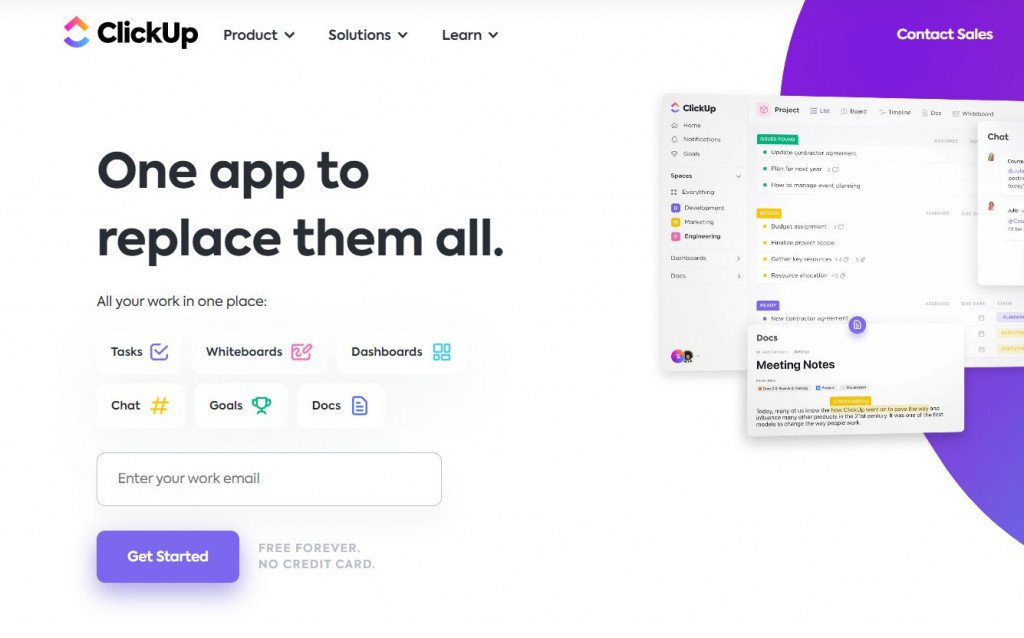
ClickUp helps with project management, adapts to the demands of your team, and allows you to plan, monitor, and oversee any kind of task. Clear call-to-action buttons are placed strategically. There are also many educational resources. This Saas landing page ensures that users have a seamless and informative experience.
Spotify

With the help of Spotify, you may access millions of songs online. It can also be a great source of design inspiration for your web design projects. At Spotify, the editorial design prioritizes art direction and collaborates. The Spotify app and website boast a clean, modern, and minimalistic design, perfectly aligning with the company’s brand aesthetic. This design approach is in step with current web development trends.
Lattice
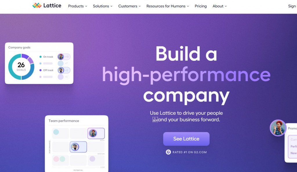
Lattice stands out as one of the best SaaS website designs. It showcases an exemplary fusion of aesthetics and functionality tailored for the modern web. The people success platform Lattice enables people leaders to create motivated, productive teams, cultivate winning cultures, and make strategic decisions.
Trello
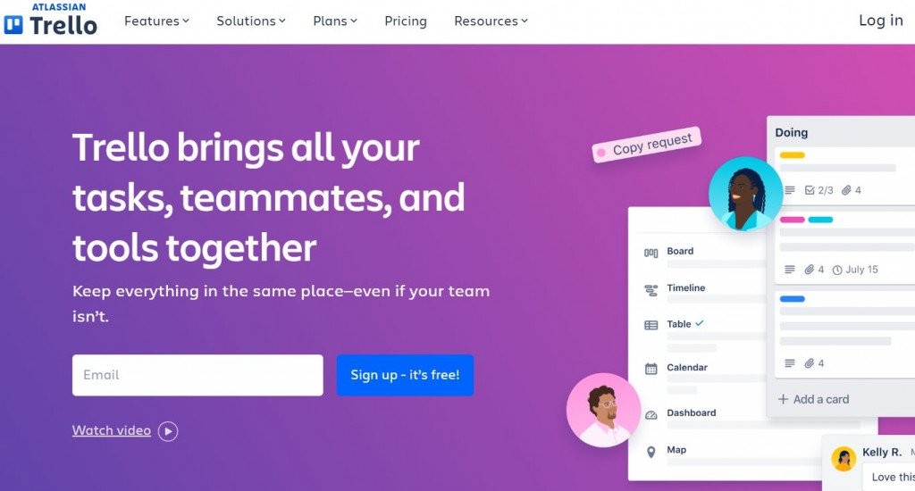
Trello website is simple, adaptable, and strong. Their software helps you see clearly who is doing what and what has to get done, using boards, lists, and cards. You can read more in the introductory guide, or start your process off right with a tried-and-true playbook created for various teams. Great UX and easy navigation.
Intercom
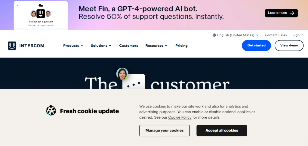
Intercom’s website features a clear and concise value proposition front and center, quickly informing visitors of its offerings and benefits. The navigation makes it easy for users to explore product and support options. To build trust, engaging visuals and animations are used throughout to demonstrate the product’s features, complemented by customer testimonials and case studies. Additionally, the SaaS website design ensures a seamless browsing experience across various devices and includes clear call-to-action buttons to guide users toward the next step, whether signing up, requesting a demo, or starting a free trial.
Conclusion
In conclusion, adhering to SaaS website best practices is essential to converting visitors into loyal customers. Through strategic website design for SaaS, companies can ensure that their site is not just a digital brochure but a powerful tool for engagement, education, and conversion.
SaaS businesses can stand out in a competitive market and achieve sustainable growth by focusing on clear communication, intuitive navigation, engaging content, and responsive design. If you want to elevate your SaaS website design, Cyber Craft can help you effectively capture and engage your target audience. Contact our managers and let Cyber Craft’s expertise guide you to success.
FAQ
1. What is SaaS website design?
SaaS website design refers to creating and developing websites specifically for SaaS (Software as a Service) companies. These designs prioritize user experience, ease of navigation, and clear communication of the software’s value proposition to effectively convert visitors into customers.
2. Why is design important for SaaS websites?
Design is crucial for SaaS websites because it directly impacts user engagement, conversion rates, and customer retention. A well-designed website helps explain the software’s benefits, making it simple to understand the product and purchase.
3. How does a SaaS website design contribute to a company’s success?
A good SaaS website design can significantly contribute to a company’s success by enhancing the user experience, improving brand perception, and increasing conversion rates. It ensures that visitors have a seamless experience, find the information they need, and take action, such as signing up for a trial or purchasing.
4. What are some key elements of effective SaaS website design?
Effective SaaS website design elements include simplicity, clear messaging, intuitive navigation, responsive design, strong call-to-action (CTA) buttons, and high-quality visuals. These elements work together to create a user-friendly experience that guides visitors toward taking the desired action.
5. How often should a SaaS company update its website design?
A SaaS company should consider updating its website design every 2-3 years or whenever there are significant technological changes, user expectations, or the company’s offerings.


