By 2020, the dark theme in UI design had almost become a key trend. Apple and Android, as well as other major market players like Google, WhatsApp, Instagram, etc., switched to dark mode vs light mode. No wonder, even nowadays, that dark-themed interfaces are loved for many reasons. Let’s see which’s better, light or dark, and why.
Ah, the saga of dark mode vs light mode. Which is better, and for whom? As users use digital devices, they’re presented with two distinct visual realms. Choosing between these modes isn’t just an aesthetic call; it’s a dance between user experience, accessibility, visual performance, and the subtle art of energy efficiency. So, let’s explore where dark and light collide.
What Is Light Mode?
‘Contrast polarity is a term used to describe the contrast between text and background. Positive contrast polarity is a definition that refers to text with a dark font on a light background (Light Mode).’
(NNGroup)
For people with normal vision, from a physiological point of view, the content of any text is better perceived in light mode, but some people are more comfortable working in dark mode. Light mode and dark mode are two sides of the same coin, and the best solution is to have both available.
Examples of Light Mode
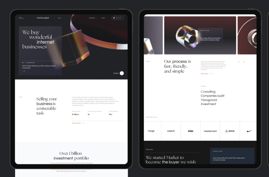
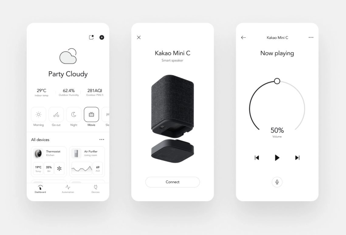
Here are some awesome examples of beautifully designed UI from Cyber Craft using light themes:
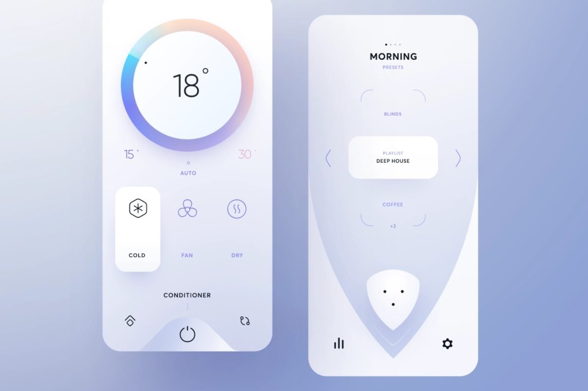
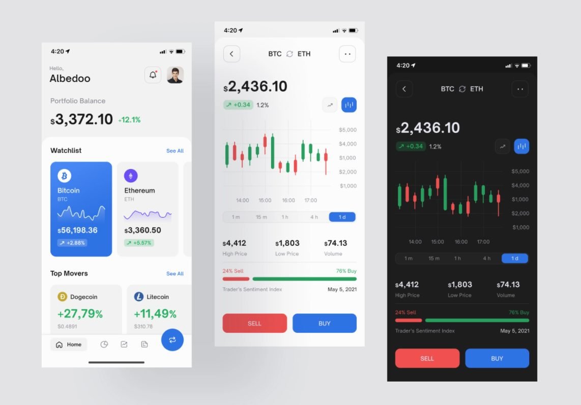
Tuning in to a dark one:
Retrieved from Dribbble
What Is Dark Mode?
As in the first case, negative contrast polarity indicates a combination of light text on a dark background, and this kind of black or other dark background is dark mode.
Dark interface modes are designed to display less light than light mode and extend battery life or serve as relief for tired eyes. The amount of light in the environment affects energy consumption or the physical state of our eyes. It also affects our data perception. How your eye responds to the amount of light in the environment is the key to understanding how to build effective dark-themed interfaces.
Examples of Dark Mode
Here are some dark vs light theme designs worth your attention.
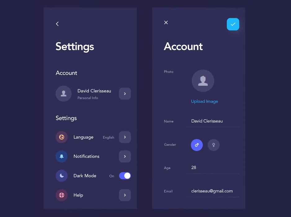
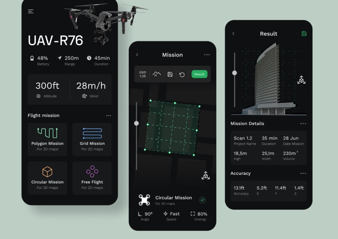
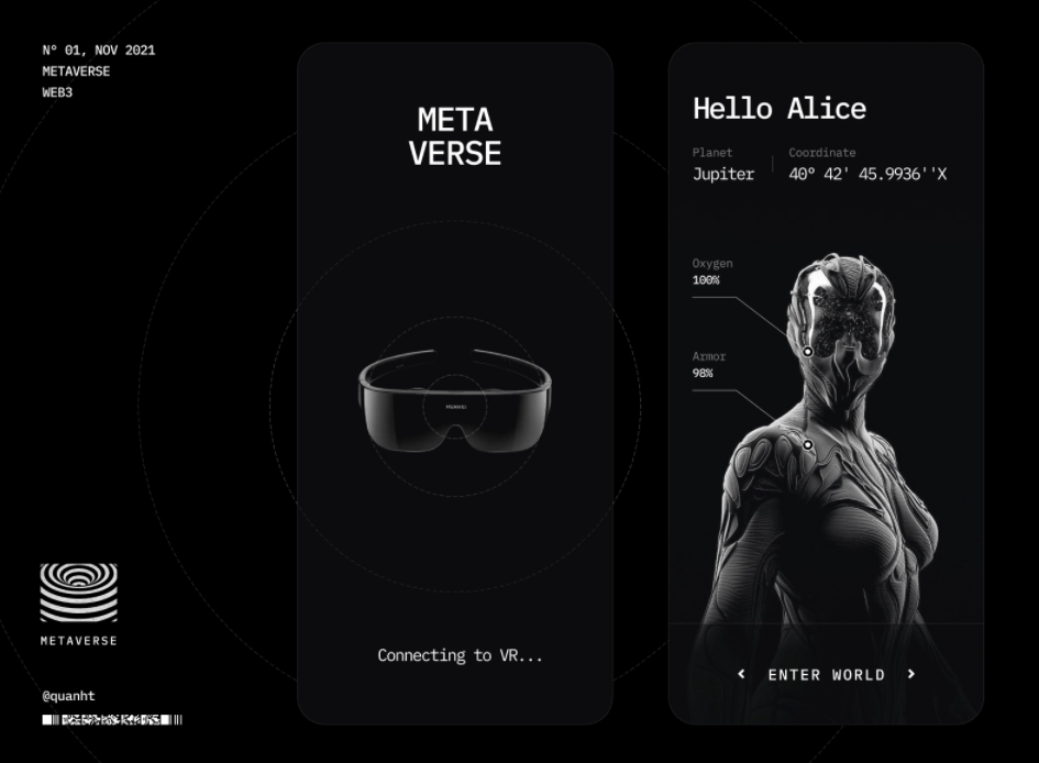
How does your environment affect your visualization?
Though dark mode is increasingly used in mobile and desktop apps, some manufacturers claim that a dark interface, compared to a white background, is less stressful for the eyes and positively affects vision. True or not, for light mode and dark mode, considerations should be made based on eye sensitivity and screen tests conducted in environments with various lighting intensities.
Eye sensitivity
To learn how a dark theme affects vision, you need to understand how the eye reacts to different colors in different settings.
Colors that are too bright irritate the eyes.
Pure white can also cause discomfort, especially in the dark: it is dazzling. Imagine a flashlight beam glaring directly into your eyes – the same sensations arise from a bright light monitor experience.
Calm tones are better for perception: light green, blue, and gray.
A black screen protects the eyes in high-contrast lighting. If the user looks at a black screen in a dark room, then nothing glares or dazzles the eyes.
The main thing to remember is that the eyes get very tired with a sharp drop in contrast. This can lead to headaches and other forms of discomfort.
The screens
Bright or white light from a gadget screen is especially harmful in high-contrast lighting conditions. For example, when a person looks at their phone screen in a dark room.
A single bright light source in a dark room can also reduce vision. Therefore, if using digital devices in the evening, decreasing screen brightness or setting the device to night mode is recommended.
Research confirms that black text on a white background is more readable for a test participant when the room is lighter than white text on a black background. This is because when looking at black screens of any size, the pupils dilate, due to which vision may be slightly distorted. But when looking at a light screen, the pupils remain narrow, and distortion doesn’t occur.
All of this should be applied when considering light mode vs dark mode UI concepts.
So which is preferable: dark mode or light mode?
Is dark or light mode better? Depends. Though you may be lured to just follow UI/UX design trends, this decision should be made based on many factors.
Some dark interfaces are designed to minimize computer vision syndrome. This is a real problem that millions of people face every day because, with the rise of digital technology, we look at screens most of the day. Anything from computer overuse to regular exposure to bright light can provoke computer vision syndrome. The main symptoms are headaches, neck pain, loss of visual acuity, and burning eyes.
Can this be avoided? Developers have been thinking about this for a long time. For example, business SaaS products and media editing applications are typically used for several hours at a time. Many have been designed with a dark interface to reduce eye strain. In doing so, they maintain visual clarity at the optimal level. However, this approach requires a thorough preliminary design assessment.
Which mode is better for UX?
Here, views also may differ. One person says it’s light. Another says it’s dark for sure because it’s a definite upward trend. Anyway, in UX, we say that it’s better not to trust what users say but to test out various UI mode performances under multiple conditions. Run a dark mode vs light mode A/B test and see what your users prefer.
Thus, is dark mode better than light mode rather depends. Nevertheless, we can’t simply avoid the real pros of the dark theme, which may be significant for your UX design:
- Dark mode saves energy for gadgets with OLED displays, such as those used in TVs, computers, iPods, smartwatches, and smartphones.
- On displays, when a color image or background is used, the charge is consumed by the screen’s backlight.
- For black, backlighting isn’t needed, while white, on the contrary, consumes the most energy. This means that if you make the background of the screen dark, the gadget will drain more slowly.
- A dark background is useful when editing images: it emphasizes the visual part and helps the user focus on the graphics.
Finally, dark mode, the favorite of modern UI design, is comfortable for people with photophobia – a disorder that is accompanied by increased photosensitivity. A bright screen irritates eyes and tires them to such an extent that a person simply can’t look at the screen at all.
So, dark theme or light theme? The right answer will depend on all the factors listed above.
Conclusion
Thus, before you decide on dark mode or light mode for your next UX project, take heed of the differences, quality, and impact both themes may have on the user and their focus.
We all use phones and computers and watch TV – these devices are adjusted so that the eye perceives them quite naturally. Black text on a white background is perceived with contrast and doesn’t contribute to eye overload – mainly if the appropriate correction is applied.
Contrarily, the eye perceives white text on a dark background in a distorted way – like headlights in the dark, when halos are formed. Such micro halos may also be formed around the light text (not white) on a dark background and blur the outlines of letters. This increases eye strain and can lead to excessive visual fatigue. Consider this when choosing dark mode vs light mode.


