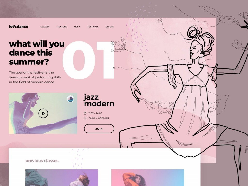
A website header is an essential part of the web design process that will grab all the attention of potential customers. Nowadays, most web designers tend to simplify website layouts, so website page headers are the only things left to get all the attention. A website header design should reflect the spirit of your brand and make the right first impression on the user.
According to a ui design company study, the first opinion on the website is formed subconsciously and very fast: within about 50 ms from the moment the user opens the link. It also can affect the user’s intention to make a purchase, return to this website and even recommend it to their friends. In this case, a header plays the role of a welcome mat that your customer will notice first and decide whether to stay and make purchases or leave and simply close the tab.
A stunning first impression was not the same thing as love at first sight. But surely it was an invitation to consider the matter. Lois McMaster Bujold
In this article, we will discuss a website header to better understand this essential web design element. We’ll also share some website header ideas for your inspiration.
What is a website header?

The website header is a section of the website situated at the very top of the screen. Some time ago, it was associated with a thin line at the top of the website with a logo, contact details, and a call to action. But nowadays, modern designers place the header above the fold of the homepage.
The header is the first thing that you pay attention to when you visit the website. It can be described as a visiting card of your company. It usually provides basic information about your brand and contact details. The user can check the header only to decide whether your website is suitable for their needs or not.
Some designers prefer to make web header design for each page of the website. The header on the main page usually contains more information than other pages. In this case, it’s important to keep the stylistic consistency of the headers so that the website looks like a single project, not just a collection of various pages.
What does a website header include?
The main aim of a website header is to give the user all the essential information about your website: what kind of brand you are, what type of services or goods you offer, how to reach your back, and whether there is any kind of promos available now.
Besides, the website header designing should incorporate the essence of your brand and evoke positive emotions to form a good first impression.
Some of the essential header elements are:
- Logo of your brand or other identifiers;
- Call to action;
- Some text or a headline;
- Navigation through the website;
- Search bar.
These elements are important. However, you don’t necessarily have to include all of them at once. Cool website headers should be brief and easy to navigate through. If this part of the website is not understandable enough for new users, you can easily turn them off.
You can use a minimalistic header if it matches the overall design. However, leaving the header too empty is not a good idea as well. It’s all about the balance and the style.
Here are some more elements for the website header best practices, and you can read more about them in detail.
Branding Name
As you say your name first when meeting new people, a website header should contain your brand’s full name. According to research, the brand’s name can define a potential customer, and it’s better to carry some anthropomorphic characteristics for users to identify with. According to this research, personified brand names are more favorable to the audience than more technical (less personified). Moreover, the brand’s name can also suggest the type of services and goods the company provides and their quality.
Logo
According to Nielsen Norman Group’s study, users are 89% more likely to memorize the brands’ logos when shown in a traditional top-left corner position of the website header. However, breaking this tradition and placing your brand’s logo in the right corner or the center of the header may make your website stand out among the competitors.
Placing your logo in your website’s header helps users memorize it and navigate through your website. A study also shows that animated logos can be a great choice to attract new customers. However, they should be added in regards to your brand’s identity. Animated logos are associated with excitement and fun, while static brand logos are more conservative and calm.
Navigation Menu
The navigation menu is an important part of the header, but try not to oversaturate this section with different links. If the user is lost on your website, they are more likely to leave, and the navigation menu should be a guiding light for them.
Make sure to add a clear map of the website with all the website sections visible so that anyone can easily find needed materials or categories on your website.
Shopping Cart
If you are building an online shop, a shopping cart is an integral part of your header. It is usually situated in the upper-right corner of the website, and it should be responsive to the user’s action. For example, there should be a notification that some items in your cart are waiting for your checkout.
If your shopping cart is not working properly or is not visible enough, it may lead to a so-called “shopping cart abandonment behavior.” To avoid that, in its study Research Gate recommends adjusting the sorting system (placing the items in chronological order is preferable) and setting reminders about the full shopping cart.
Search bar
Search bars are usually placed near the navigation section of the header. This is the first place where a lost user can come and find a needed part of the website, almost the same as “You are here” stands in the malls.
It should be easily located and simple to use. You should also make sure it works properly and leads the customer to the desired section of the website in the quickest way.
Login / Register
Almost everyone will automatically look at the upper right corner of the screen when they need to register or log in to the website. This button has already found its place on the website headers across different platforms and websites. We do not recommend changing its position as it may simply confuse users.
Social media links
Not all websites include the links to their social media accounts in the header. Still, adding a contact section is strongly advised. You can include your phone number, email address, a link to a direct chat widget, and social media links in the “contact us” segment. However, if your social media account plays a really important role for your brand, you can include them directly in the header.
Languages
International platforms and online shops should include an option for choosing the website’s languages. This is an important feature to attract customers from different parts of the world.
It can also be a necessary addition for countries with multiple spoken languages, like Canada or Belgium.
Best Practices For Website Header Designing With Examples
There is no unified way or pattern to create website headers. Each website is unique, and its design should reflect the essence of your business.
However, there are some tips and tricks that may suit your website idea and your business direction. We will show you some interesting website header examples so that you can explore many possible options for your website header design inspiration.
#1 Use crisp, readable fonts
Try to avoid using unreadable cursive fonts in the header of your website. The font should be clear and readable from first sight. You can also use shorter words and contract colors to make the sections of the website more distinctive.

#2 Maintain a consistent design
The header must blend in with the rest of the website page’s design. Try to use a consistent color scheme and keep the same style for all the illustrations. You can check this header web design inspiration from Firearm Studio.

#3 Include a clear call to action
Call to action buttons should be easily accessible and understandable for every user. They also should be noticeable as the client should not search for the contact information or a log-in button for too long.

#4 Add illustration or animation
Using illustrations or even animations in your website’s header is a perfect way to personalize the brand’s style and create a special connection with the customers. However, keep in mind that the image should be distinct and readable even in a small size to fit the header. We at Fireart have a lot of illustrated website header design ideas for you!

#5 Possibilities of the header
There are several styles of the website header you can choose from, and we will discuss the trendiest ones. You are welcome to check the possibilities of the headers as well as website header design examples.

- Fixed website header
A fixed website header is also called “sticky.” It means that it “follows” visitors when they scroll down the website. For most of the marketing spheres, it is considered a standard choice.
Fixed headers can improve a user experience with the website as they are great for e-commerce websites or services websites, both mobile and desktop versions.
- Hidden navigation (hamburger menu)
A usage of hidden navigation or a hamburger menu is a rising trend in website design. It is usually a small icon with stripes that reveals a full menu bar after it’s clicked.
For the website’s usability, it’s a great option as this header style came from the mobile versions and is pretty common for desktop versions.
The hamburger menu is applicable for promotional landing pages as it makes a great accent on the product itself. However, this header style might not be the best choice for online stores as access to the shopping cart, and the menu is essential.

- Mobile header
The number of mobile users has surpassed the number of 6 billion in 2021. For this reason, your website’s header should look and work great both on the desktop and mobile versions of the website. It should be vertically oriented and contain all the essential details for easy browsing from any mobile device.

Website header can be your door-opener
The website header is a visiting card and the soul of your website. It is the first thing every user sees. It should grab attention and reflect the essence and philosophy of your brand.
To sum up, we would definitely advise you to pay special attention to your website header design and keep it up-to-date. The information and the style of the header should always be actual. We hope you have found some header web design inspiration after reading our article. If you still struggle with the design solutions, our team of designers at Cyber Craft is here at your service.


