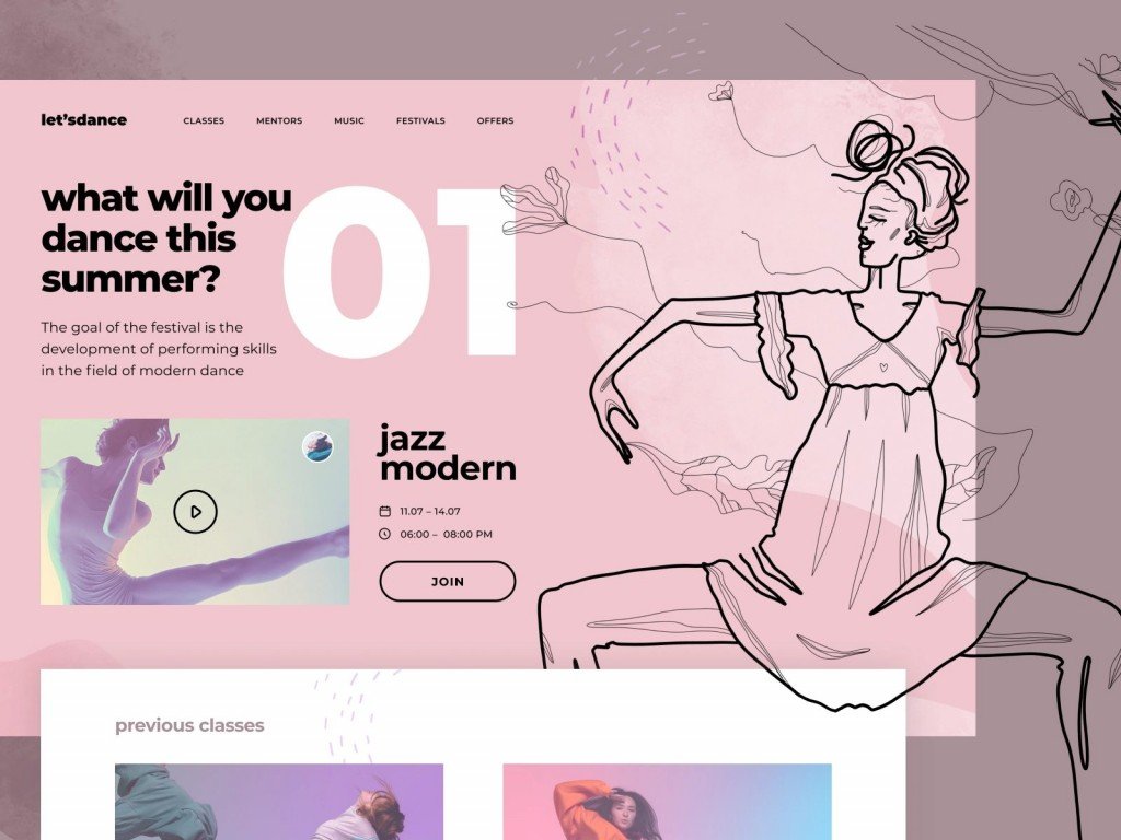
There is an English aphorism that says, “A picture is worth a thousand words.” Indeed, it is better to show something than explain it with tons of words.
As for web design, the visual component gets all the work done when it comes to attracting customers. Nice and well-put images make your website appealing to the eyes of viewers and significantly promote the User Experience.
You are probably wondering how to select images for a website that would contribute to your business goals. That is why we decided to help you.
Below we offer five tips that will show you how to choose images for your website.
Quality Is Above All
Always try to use images of the highest possible quality. Sizable, pixel perfect, high-resolution images are something that you should look for. Browsing photo stocks, pick the right size that will perfectly look both on a desktop and mobile device.
If your website must include photos of your employees, then you can even use a smartphone to take pictures. Most modern phones have good enough cameras to provide you with a high-quality image. But that’s surely nothing compared to the professional camera in the hand of an expert photographer.
And never try to make any picture larger than it has to be, since it may only lead to distortion.
Use Images of People

Though misanthropy is trendy in the age of the Internet, most people actually like being connected to other people. Even if the primary focus of your business is technologies, adding a human element will help to build this connection. For instance, you can use an image of how a person interacts with your technology. Even a picture of a human hand holding a smartphone with your app on is enough.
But you should avoid using common stock photos. People will likely get a bad impression of your business if your website has photos that they had seen earlier on other websites.
What people are looking for is something authentic. They want to believe that your website depicts images of real people who are directly connected to your business.
Keep Images Relevant to Your Business
Never just insert random pictures on your webpage. Regardless of the purpose of your website, the images on it should always be relevant to your brand and its goals.
That is why you should be extremely strategic with the image choice and its placement. For example, if your brand sells jewelry, the images on the page should not only depict your products but also be visually appealing and enticing to potential customers. And if your goal is to boost the sales of your product, then show real pictures of happy customers.

Let the Pictures Do the Talking
“Less is more” principle is so true to designing a website. Nobody wants to go through a webpage that is overloaded with text. Instead of making a text-heavy page, diversify your website with images that do the talking.
Think of an image as of an essential element of the page content, rather than just as of eye candy. Every picture should bear a message that a viewer can instantly perceive.
And next time, when you think of how to choose images for your website, focus on the page’s content and think of what particular purpose you want your image to achieve.
Remember About SEO
Even if you found the image that you like, take your time and make sure that this image is optimized for search engines before you upload it.
People often save images giving them such names as “Picture1.jpg” or don’t even bother to rename a downloaded picture with the automatically generated name, like “ScreenShot2019-11.jpg.” And then upload those images to their webpages.
Don’t be like them. Be smart. Name your picture by what is depicted on them. Also, it is better to use hyphens instead of spaces, underscores, and punctuation marks.
If it is possible, use keywords for search optimization when making an alt text to the image.
Final Thoughts
A nice and well-put image on your website is like the icing on the cake. It should bring everything together: engage a viewer, refer to your business goal, and speak more than a text does. The mentioned above tips show how you can make it happen.
Yet, if you still don’t know how to choose images for your website so that it will attract potential customers and make them come back for more, then you may contact our designers. When it comes to product design, Firearm can provide you with all the necessary assistance.


