23 Best Website Animation Techniques for Your Web Design
Website animation design has experienced many changes and disruptive innovations over the years. Recently, web designers have started using web animations to breathe life and motion into static website layouts.
Web design animations have become a new trend dominating our screens, enhancing user experience to be more intuitive and engaging. Moreover, website animation turns an ordinary user experience into an unforgettable journey that amazes with its bold colors, movements, adventures, and exciting interactions.
In this article, we are uncovering the power of animations in web design and introducing the most popular types of webpage animations.
Why should you use animation in your website design?
The use of animation in website design continues to increase. To make sure you are up-to-date and give your website a competitive edge, it is best to apply animation. There are many other reasons for using it.
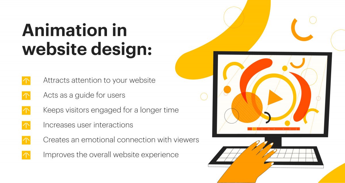
Animation in website design:
- Attracts attention to your website
- Acts as a guide for users
- Keeps visitors engaged for a longer time
- Increases user interactions
- Creates an emotional connection with viewers
- Improves the overall website experience
Deciding which website animations to incorporate into your website design is essential. You need to ensure that everything on your website complements this experience well. Always keep in mind that it is better to use simple animations, as shown in the examples of animated web pages below. Complex website animation effects can create an opposite reaction and lead to long loading times and user dissatisfaction. When designing websites for SaaS applications, choosing subtle yet effective animations can enhance user interaction and contribute to a seamless and intuitive user experience, ultimately driving user engagement and satisfaction.
The pros and cons of website animation
Let’s consider the main advantages and disadvantages of using animations in web design for your business.
Pros
- You can express website ideas clearly and rapidly. Animation is the best approach to transmit knowledge of or information about anything, as well as a narrative. It utilizes visual cues to communicate your brand’s ideas and intentions, making complex concepts easier to understand.
- Increase user engagement by using animations. Animated elements, such as buttons, can draw the user’s attention, increase clicks, and entice people to explore the site more thoroughly. Incorporating animations interactively leads to a more engaging and fulfilling experience.
- Animation adds to the understanding and speed of processing the data by users. Thus, it’s simple to utilize when conveying a lot of information succinctly or explaining abstract concepts and ideas. Animations can enhance user experience by offering visual feedback, directing attention, maintaining a theme, and showcasing personality.
Cons
However, animations may also be detrimental to the interface’s performance, accessibility, and cognitive load. Here are some of the potential drawbacks:
- Developing and integrating animations into a website can be a lengthy process, requiring significant time investment.
- Compared to live-action animations may lack a sense of reality, which could affect the authenticity of the message being conveyed.
- Animations might not always effectively convey emotions, potentially leading to a disconnect with the audience.
- Creating high-quality web animations demands a certain level of technical skill and knowledge, making it a challenging task for those without the necessary expertise.
- Animations can slow down website load times, which may negatively affect user experience.
Additionally, improving the dynamic nature of your web pages shouldn’t come at the expense of performance. Poorly executed web animations will interfere with users, leading to lower engagement and higher bounce rates.
Anyway, adding animation to the website within reasonable limits can serve you well. Below we present 20+ best examples of simple website animations that you can take as a basis to improve your website design.
Techniques for animation in website design
These web animation techniques can guide you on how to create even more incredible website designs.
Before you choose which type of animation to add to your site, make sure to pick one of the best web design styles for your website with our comprehensive guide.
1. Navigation

Navigation is one of the most common animations on websites. Hidden navigation has become particularly trendy today, as it provides a smoother user experience. You only need to click on the icon to be directed to the next stage.
Designers use this technique to save more whitespace on the screen. Website animations used for navigation are
https://www.high-endrolex.com/9
supposed to keep the user focused on the main area of a website. Here’s what you can do with this type of animation:
- Organize UX architecture
- Categorize your site
- Help customers to easily find the content of each category
- Reduce the time users spend searching for items on a website
- Make pages more accessible
In addition, great navigation keeps users engaged and invites them to explore a website and its products. You can hire professionals to provide you with the corresponding digital product design services or look into ready-to-use navigation bars that can be inserted into the page.
2. Hover animation for desktop

Hovering is another widely used animation for websites. The CSS website animations, which can be created using JavaScript, provide feedback on users’ actions. Hover animations also improve the overall user experience by simplifying navigation.
However, a significant disadvantage of hover animations is that they do not work on mobile devices due to the touchscreen interface. Luckily, elevation animation creates the same effect on mobile devices. Just one tap is required to be informed about an interaction immediately. In this way, the user will know that they have triggered a specific response.
3. Progression

The loading time can be frustrating for some users. Reducing it is not always possible, as it may significantly limit opportunities for your website design.
To overcome this issue, a site designer can use progression animations. It is an effective method to eliminate negative user experience caused by lengthy loading times. Progression animations work by entertaining the user when information is loading, creating an illusion that the wait time is shortened.
When designing progression animation, it’s recommended to:
- Keep them simple – if they are too complicated, they might become too obvious to the user and may drive the user’s attention back to the loading time issue.
- Make them engaging. After all, the main goal of loading animations is to capture the user’s attention.
Website animations can also be used to show progress engagingly throughout a website. For example, loading bars can be used to show that the process is actively happening, while animated percentages can display the amount of the uploaded information.
4. Attracting attention

By adding motion to your site, you increase your chances of drawing the user’s attention. So, why not leverage it on your website? Animations that are designed to attract attention usually motivate customers to take the desired action.
Simple website animations such as a nod or shake on an icon can be effectively used in many parts of your design, including:
- Forms
- Calls to Action (CTA)
- Menus
- Feedback forms
5. Skeleton screens

Skeleton screens can be used to encourage users to interact with your site. Skeleton screens are essentially blank versions of pages that are divided into sections, which are then gradually filled with information as it loads. It informs the user that content is on its way by offering hints about the nature of the incoming data, be it an image, text, map, etc. This anticipation allows users to understand the structure and content type they can expect, enhancing their sense of interaction with the site even before the actual content has loaded.
This technique not only improves user satisfaction by reducing the perceived wait time but also keeps the user engaged, reducing the likelihood of them leaving the page due to impatience.
6. Transition without hard cuts

Transition on a site should not be not only smooth but also work as an indication of a state change. By default, state changes in the user interface usually include hard cuts, which can be too fast and frustrating for users.
By incorporating animations into the transition process, users experience a more seamless shift from one section to another, even when remaining on the same page.
7. Visual feedback

It is always better for customers when they have an opportunity to see a response to a taken action. However, an excess of interactive elements can complicate navigation, potentially confusing users and even increasing the website’s bounce rate.
To avoid it, it’s recommended to create interactions that are straightforward and intuitive. Users should also be provided with information about each interaction to ensure they get the results they need. Visual feedback plays a crucial role in this context, serving as a direct indicator of the system’s response to user actions.
Here are a few types of visual feedback to use:
- Indicating link states, such as hover or clicked status, to show that a link can be interacted with
- Signifying button states to demonstrate when a button is active, inactive, or has been pressed
- Enhancing form elements, for example, by highlighting fields that require attention or have been successfully completed
- Providing helpful error messages that guide users on how to troubleshoot problems
8. Creative effects

Your goal is not only to create an excellent presentation that attracts viewers but also to design a unique digital experience. Creative effects allow you to add special features that can make your site stand out.
Adding interactive elements transforms each visit into a unique journey, making viewers excited and eager to explore what your site has to offer each time they visit.
9. Dynamic backgrounds
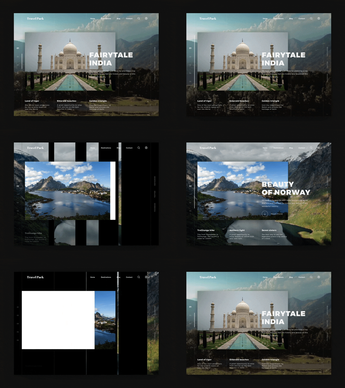
Dynamic backgrounds are one of the best animation effects for enhancing websites. An animated web page design makes the user journey memorable and helps build an emotional connection. Some dynamic wallpapers, for instance, alter based on the time of day, weather, or when you go between screens.
However, it’s crucial to remember that background animations should complement the existing content of your website rather than be the focus of the user’s attention. It also implies keeping an optimal balance between compelling content and distracting content. What’s most important, your dynamic background shouldn’t weigh down on the overall UI and UX design.
10. Galleries and slideshows

Today, slideshows have become a common feature on many websites. They offer a dynamic way to display many images without interfering with the overall user experience. Using a slideshow is a fun way of delivering many pictures at once on your website. This way users have the option of viewing these images at their own pace or they can continue searching for other content on your site.
One thing you should bear in mind when using this animation technique is the number of images to include and the speed at which the images are moving. The latter is even more important. If pictures slide too fast or too slow, it may lead to an unpleasant experience for the user.
11. Scrolling

Scrolling is a vital part of a user’s experience. Making this visually appealing is essential, as it will determine whether the viewer continues engaging with your website. Smooth scrolling provides a better customer experience and results in increased engagement.
For longer pieces of content, like articles, using scrolling well can help connect emotionally with readers. Break content into different segments and add web animations in between to make the interaction more interesting for users.
12. Whole page motion
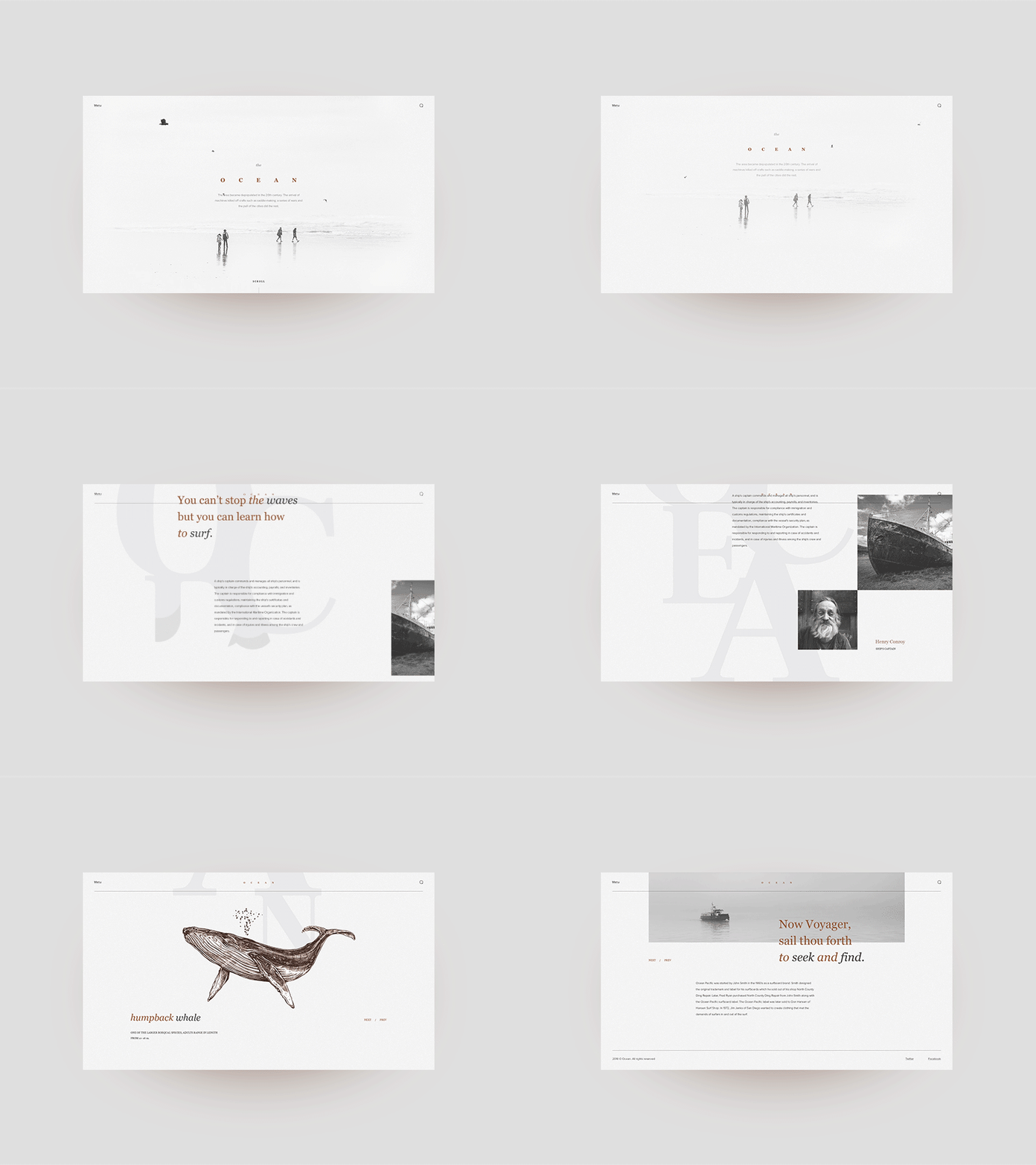
Whole page animation usually means the slight movements of the entire website background. Web motion design is mainly used to add a feeling of magical and exciting adventure to website design.
The main rule for this type of animation is that it should be almost invisible and unobtrusive. Whole page animation should just add a little bit more fresh air into a website layout and enhance the visitor’s interaction.
13. Dynamic menus

Dynamic menus are another amazing website animation example used to enhance the website user experience, making it more seamless and exciting. Most user experience designers would agree that navigation is one of the most important website elements that significantly contribute to the overall website UX design. Despite this, it’s not always easy to access.
We used to scroll back to the website footer or header to find the navigation options. However, with a new trend of dynamic menus, this action isn’t necessary. This type of menu sticks to your scroll, so you can always access the navigation bar and go to the intended page easily.
14. Welcoming animations
The user’s first impression of a website is crucial because it shapes a brand image almost instantly. That’s why it’s advisable to use exciting welcoming animation to engage users and spark their interest in a brand from the very beginning.
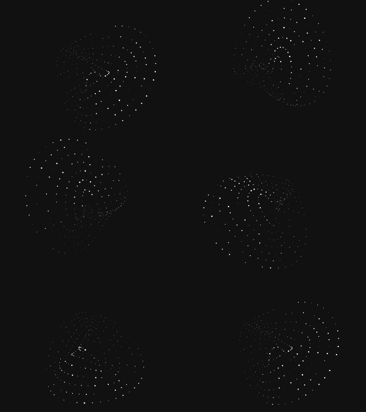
These animations are also known as onboarding user animations. This animation technique is widely usedd to welcome website visitors and introduce a brand creatively to the target audience. Such practice helps entertain users and encourage them to use your brand’s product or service again. Particle Love, a website by Edan Kwan, provides a perfect example of real-time welcoming animations.
15. Storytelling
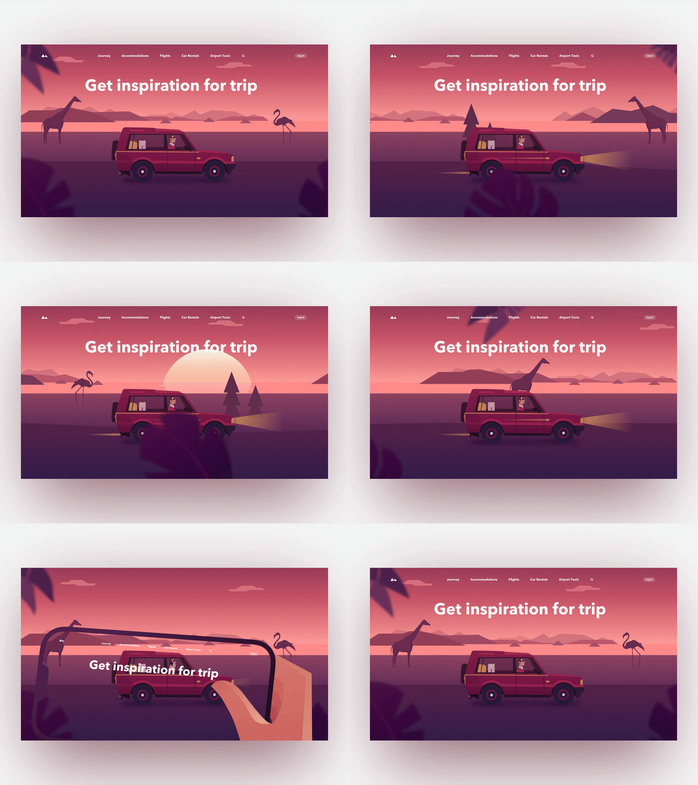
Modern users are more interested in products and services if a brand presents them through storytelling. Animated storytelling has become another popular type of animation for the web, serving to introduce a brand creatively and establish emotional bonds between users and a company. Usually, storytelling website animation effects are used in longreads, as this format is the most convenient to tell a comprehensive and engaging story.
16. Page motion
Motion helps make a UI expressive and easy to use. Using page motion graphics design solutions may help you to enhance your website in many ways. The key here will be not to overdo it but keep it a harmony. While a whole page animation may be applied as an effect which usually means the slight movements of the entire website background, the targeted animation may be used on landing pages or specific sections of the site.
Now that we’ve explored the basic techniques for website animations, it’s time to dive into a few successful websites animation examples.
Creative website animation examples
• Madwell

This online store uses parallax to create a background that seems mobile. Sections featuring different products have slideshows and galleries, giving users a chance to view all images.
The navigation ensures a smooth transition from one part of the website to another. When the menu button is clicked, it produces an oversized menu that covers the entire page. In the “brief” section, creative animations engage the viewer while checking content.
Additionally, various animations are used each time a user scrolls down the website. This ensures that the user doesn’t get bored with the same animations. Most of these animations move peculiarly, using a black background with colorful structures.
• Platform

This website’s design focuses on enhancing user interaction. It features a form which resembles a questionnaire that users have to fill out, making the experience more pleasant and interactive for users.
When a user starts answering these questions, they will get feedback on how many questions are left to complete the form. Upon completion, the viewer has an access to the summary of their responses; however, access to the results is blocked.
The results can only be viewed once the user submits their contact information. This is a clever way of making sure users perform the desired action.
• Arrive Hydrated

Arrive Hydrated uses motion animations for website to grab users’ attention. This animation allows users to select a destination from around the world. The globe on the website can be moved using the cursor, making it easier for users to select their destination.
A single click on the menu button displays various sections appear on the site on the entire web page, making it easier for users to select the section of interest. As you move the cursor over each section, a parallax effect occurs.. This website also uses a percentage loading bar when downloading information.
• Jannata resort

From a slideshow to motion images, this site definitely knows how to catch the user’s attention by applying the best animation effects for website. There are two buttons on the right part of the website: one for the menu and another for booking options. Scrolling animations are also a key feature of this website design.
As you scroll down to view information, images appear as if from nowhere, making the website even more creative. This sort of dynamic storytelling ensures that viewers stay engaged the entire time they are on your website.
Each part of the website has a sense of motion. Images are placed next to information in each category, which adds to the creativity, making the viewers’ experience exciting and engaging from start to finish.
• Echo

Echo introduces what we might call the best animation format for websites. When a viewer scrolls down, information is provided via a scrolling storyline, allowing for a smooth transition from one UI element to another. Also, whenever the user scrolls down, screenshots follow with new information.
This simple yet cool animated website design providest users with easy navigation and smooth transition from one section to another.
Technologies for creating web animations
So, you’re already familiar with the most amazing and popular website animation styles and types. Now, it’s time to learn how you can add them to a website. Once designers have created or chosen the animation, they pass it to front-end developers —programming magicians who should put it on a site. Here we will consider the best technologies and frameworks used for web animation.
CSS
The first technology worth mentioning is CSS animation. It helps front-end developers make transitions between different states using keyframes. This type of animation is lightweight, high-performing, and doesn’t require any external libraries for implementation.
Developers can add animation to a web page by using DOM (Document Object Model) and setting customized properties. Another advantage of CSS animations is excellent compatibility with different screen sizes, which is a crucial factor in creating a great website. The only disadvantage is that CSS animations may fall short in simulating realistic motion..

JavaScript
This powerful programming language is also beneficial when it comes to website animation. It gives much more flexibility compared to CSS animations.
JavaScript’s only con is that it implements all animation through external libraries, impacting performance and loading time. It is most useful for animations that need to be paused, slowed down, or stopped.
SVG
Do you know what SVG stands for? It’s Scalable Vector Graphics. As the name suggests, SVG is a perfect solution for creating easily scalable animation. It looks excellent on a website even if you zoom on it, since SVG doesn’t have pixel restrictions.
Developers can use CSS to make SVG elements. Also, SVG has its own animation functionality, that allows creating more complicated animations.
Canvas
Canvas is great for implementing complicated animations and rendering large-scale visuals. It’s a pixel-based solution empowering you to make complicated images with different shades, colors, and motion. Most importantly, it achieves this without affecting the animation performance.
WebGL
WebGL is usually used to generate sophisticated animation effects and 3D renderings. The most impressive fact about WebGL is its capability torender animation at 60 frames/second (just imagine!). To utilize WebGL, developers must work with Canvas, although integrating the two can be quite a complex process.
Website animation tools and JS frameworks
Now, that you’re familiar with the proven animating practices, let’s delve into the best web animating tools.
A variety of external JavaScript libraries are available to bring your website to life. Here’s a closer look at some of the top choices..
GreenSock (GSAP)
GSAP is a property manipulator used for animating, rotating objects, and scaling each property separately. It’s a flexible solution that enables you to animate almost anything you can think of, from CSS and SVG to DOM and more, making it a go-to solution for web animators..
ScrollMagic
ScrollMagic is a plugin that perfectly works for scroll transitions, parallax effects, and different kinds of interactions based on the web visitor’s scroll.
Velocity.js
Loved by major brands like Uber, Instagram, and WhatsApp, Velocity.js is an extensive JavaScript animation library. It’s a perfect tool for generating extremely sophisticated animations.
Mo.js
Mo.js is a customizable JS library used for website animation. To avoid using large-scale files, you can use Mo.js with its custom-chosen elements. This library is perfect for enhahcing user experience and user interface with website animation.
Anime.js
Anime.js is the library that works with CSS elements, SVG, DOM, and JS objects. It allows creating light code and handling many timings, easings, etc.
Vivus
It is the library that allows you to add dynamics to SVGs. Vivus enables crafting original animations by combining different paths, techniques, and timings.
Three.js
Three.js is the most famous JS library for creating three-dimensional animations. It has an array of ready-to-go internal tools and components that make the animating process much easier and faster.
Website building platforms that don’t need coding
Readymag
Readymag is a widely-known digital platform for building website pages. It offers a complex of basic animation features that enable you to add motion to your website elements, allowing them to rotate, scale, and move.
Webflow
Webflow is an alternative platform that allows you to craft multi-step website animations without programming them. In Webflow, you also can design micro-interactions to various components to trigger motion or the state after clicking or hovering over them.
Wix
Wix is another web building platform with animation functionality that can add more interactivity to website elements. Moreover, it enables you to generate page transitions, add various effects to them, and move elements across the page.
Conclusion
Whether subtle or bold, animations can enhance the experience users receive when visiting your website. Animated graphics for websites makes them more engaging and interactive when used wisely. However, the key to success is, ultimately, to keep your animations as simple as possible.
You can contact us at Cyber Craft to discuss any questions regarding the topic and get more information on creating website animations or digital product design services today.


